Tuesday, 15 October 2013

The HIVE Art Group at the Royal Albert Memorial Museum, Exeter


The main art gallery in the Royal Albert Memorial Museum in Exeter has followed up its Gillian Wearing exhibition with a show featuring three artists whose names you’re less likely to be familiar with. Together they form the group known as HIVE, which won a competition run jointly with the local newspaper the Express and Echo. Readers voted for their favourite amongst a shortlist selected from submissions made by groups in the Exeter area. Ian Harbour was the Hive member elected to give some introductory comments at the opening. He made reference to Grayson Perry’s Reith lectures and the light they shed on the machinations of the Art Establishment and the way it sets out to determine taste and what is presented to the public as significant Art (Art capitalised in more ways than one). Ian professed to being a big fan of Kurt Vonnegut, which brought his novel Breakfast of Champions to mind. This book includes a character called Rabo Karabekian, a minimalist artist who has just sold a painting to a provincial museum for $50,000 (bear in mind this is a novel first published in 1973). His painting, entitled The Temptation of St Anthony, is field of commercially produced wall paint (‘Hawaiian Avocado’) with a vertical strip of orange reflecting tape to one side. Vonnegut, who appears as a godlike authorial presence in a diner where everyone gathers, comments ‘I thought Karabekian with his meaningless pictures had entered into a conspiracy with millionaires to make poor people feel stupid’. However, the artist’s explanation that the day-glo strip represents an individual life as a column of light proves a revelation to the depressed author.


Ian also pointed to the Art Everywhere project, which saw works of art in British collections selected by the public appear as posters alongside the usual chaos of advertising signs, as a false example of the democratisation of taste. The range from which people were allowed to choose was preselected and fairly rigidly defined, following a familiar narrative path through the story of British art. Would there really be such a significant representation of the work of the Young British Artists if this were really a popular choice, he asked? (As an aside, I’m now frustrated that I didn’t come across some of my favourites from this selection – Paul Nash’s Landscape of the Vernal Equinox; Samuel Palmer’s In A Shoreham Garden; Richard Dadd’s The Fairy Feller’s Masterstroke; and in particular, Dorothea Tanning’s Eine Kleine Nachtmusik, whose surrealistic dream corridor would have appeared even more disconcertingly strange when happened upon in a bus shelter. I did see the paintings by Edward Burra and Michael Craig-Martin, Lucian Freud’s Girl With A Kitten – he had two pictures selected, as did Peter Blake – Henry Raeburn’s ice-skating reverend and Barbara Hepworth’s shell-like wooden Pelagos sculpture). However, through this RAMM and Express and Echo competition, he suggested, a real democratic exercise of public taste had been permitted to determine what ended up on the walls. So, what does the public choose when given the chance?

Eine Kleine Nachtmusik - Dorothea Tanning
The three Hive artists are very diverse in terms of style and subject matter, but there is a certain shared sensibility (a Hive mind?) which gives their work a cohesive feel when collected together. Whimsy, a playful imagination, an eye for quirky and eccentric detail and a love of the mythic and fantastical run through pictures which are otherwise utterly unalike.

The Green Queen and her Bird - Su Scotting
Su Scotting’s work is the most wide-ranging in terms of media, encompassing linocut prints and acrylics, watercolours, and drawings in various shades of ink and pencil. Her subject matter tends towards the Totnesian, a green and new age anthology of the sacred, mythic and folkloric bringing together shamen and fools, hares and foxes, reindeers and unicorns, Buddhas and angels. Her glowing, honey-coloured acrylic painting If the Bee Man’s Hive Thrives, He Thrives provides a symbolic signature for the group. A stylised figure of a man presides over the busy creative hub of his apiary, the trails of bees spinning woozy spirals around him. Some of Su’s paintings form complementary series. Four Seasonal Angels leaves its female figure eternal and unchanging in essence, but rings the changes in the turning colours of leaves and blossoms which make up her hair and clothes, and blushes and dims the bloom on her cheeks. A lino-cut Cherry Blossom Buddha is another seasonal marker from the other side of the world, imprinted in red outlines. The Green Queen and Her Bird and The Blue Prince and His Hare, with their stylised side-on figures, animal familiars and surrounding decorative symbols could be twinned Tarot cards, opposites which suggest a state of completion and wholeness when brought together. God Yul and Peace are colourful folk art Christmas messages (which would make great cards) with a Swedish and Russian flavour. The Russian scene balances an onion domed building on its snowy hillside curve, and surrounds it with more fantastical towers – a wintry Russia of the fairytale imagination.

Other pictures adapt the styles of painters and traditions of which Su is evidently fond, and which she uses for her own ends. On My Way and Dancing In My Garden both employ the vivid colours and iconography of Mughal Indian miniature paintings and wall hangings to depict women in Edenic landscapes. They’re shown side-on, with huge almond-shaped eyes, wide open, alert and fully alive to the moment.

St Ives - Su Scotting
A St Ives linocut distills the town into a representative cluster of buildings as seen through a wide-angled lens, the harbour wall flattened into curving arms extending out into the sea, and waves reduced to frilly parallel lines. It summons up the essence of the town in a few economic gestures. Su seems to have been imbued with the spirit of the ‘naïve’ St Ives artist and fisherman Alfred Wallis. This is also evident in On the Island, I Am Safe in the Rain’, with its outline fishing boat floating flatly on the sea, and its perspectiveless but protectively encircling harbour walls.

I particularly like her pictures made with white pencil on black card. The contrast is very effective, and is eminently suitable for nocturnal, ethereal or uncanny scenes. There’s an owl in the snow before a backdrop of softly blurred stars; a boobyish bird extending ungainly wings which will never launch it into flight; a friendly zig-zag monster set amongst a storm of swirls; and an emblematic reindeer at the edge of a stylised coniferous forest beneath a milky smudge of a moon. A simple pencil work called The Soul Goes Home is beautifully done. A semi-circular boat carrying a calmly recumbent figure is cradled with perfect congruity within the deep trough of flame-like waves. A sickle moon hangs above, echoing the curve of the hull.

Su also evokes the comforting familiarity of creative domestic spaces and the well-used objects which fill them. Alison’s Wobbly Kitchen is an outline sketch, the wavering lines suggesting an in the moment impression, maybe made whilst perched on a stool. This is also true of In the Greenhouse, which feels like a spontaneous sketch intended to capture a moment and the feeling which led to the impulse to record it.

Some of Sam Harrison’s pictures, mainly created with ink pens, also evoke this sense of familiar domestic spaces, comforting corners or favourite spots. Idiosyncratic details can bring an element of magic or the weird into these scenes, though. A drawing of a sofa in brown ink pays close attention to every rip and indentation, as if each has an inherent story to tell. It shows an intimate familiarity with the weathered topography of this characterfully beat piece of domestic furnishing. A bony set of antlers which seem to rise from the abyss at the back of the cushions where pennies, biros and combs disappear adds a slightly unsettling element of ritualism or supernatural manifestation to this site of easeful, lazy repose, however; the familiar and homely invaded and made strange. Stove in a Shed casts a sympathetic and attentive eye on a neglected and battered iron stove which, with its bandaged pipe, has the look of an aged but still-loved pet being cared for in its decrepitude. Continuing the theme of finding value and beauty in the seemingly obsolescent, A Serious Vinyl Addiction painstakingly delineates the closely stacked LPs, dvds and guitars which are the outward signs of someone’s musical passions, locating a distinctive personality within apparent chaos and disorder (although knowing the mentality of the record collector, those LPs will be filed according to a rigorous and rigidly adhered to system). The Old Cassette Player is another piece of obsolescent technology observed with care and affection, a loving portrait of a beat up boombox. Cassette boxes casually left lying on top are titled Loved Up and Hair Loss, old mix tapes whose contents we can only wonder at. Stars emerging from the speaker grille and sequins scattered on top combine with emphatic ‘Wows’ riding on crackling zigzags to add a bit of expressionistic pop art colour, conveying some of the pleasure that the music radiating from this old machine has given over the years.

Guildhall Door, Totnes (detail) - Sam Harrison
Sam also has a liking for objects, places and details of greater antiquity, and in particular for the strange folk art and medieval craftsmanship to be found in the south west. Guildhall Door, Totnes uses finely drawn in detailing to get into the weathered warp and rift of the medieval wood and the granitic grain of the arched frame, giving an impression of character incrementally inscribed over the centuries. C16 Door, Exeter zooms in on the lion’s head carved on the grand oak door to be found in the Cathedral Close, and once again we get the impression of the aged texture of timeworn wood, conveyed through subtle shading and an accumulation of wavering lines. Sam goes into the sacred stone groves of the chapel to find sculpted and carved creatures both quirkily characterful and disconcertingly strange in its chapels and naves. A mermaid drawn from a misericord triumphantly displays her catch, and her wooden form is given vivid life with bright watercolouring. A Bird Lady is another figure from the fecund Medieval imagination hidden under the choir seats, and Sam colours her into life too, turning her fish tail into a decorative weave of Saxon knotwork.

Drawn from the original - The cathedral mermaid misericord
Hugh’s Owl is drawn from one of many such creatures populating the chapel dedicated to Hugh Oldham, the Bishop of Exeter in the early 16th century. Sam, with her Lancastrian background, may well feel an affinity for him since he was born in a village which has long since been absorbed into the sprawl of Manchester. Her owl is given a softly stippled texture, lending the appearance of stone glowing in evening sunlight. It’s quite lovely. Another Owl for Hugh adds colour, giving it pale blue eyes, beak and claws and caramel feathers and setting it against a red background. It gives it back the vivid colouring most of the statues and carvings in the cathedral would have worn in their medieval heyday.
There’s a further owl painted in oils (an oil owl) on a small block of unframed canvas which looks like a squared off boss. A characterful portrait of someone called Dave Warren, a man with wild hair and a pleasantly lived-in face, is also painted in oils, a medium with which Sam is also evidently comfortable and adept, and is maybe looking to explore more extensively.

Hugh's Owl - Sam Harrison
The piece de resistance as far as her pen and ink work is concerned, however, is After A Portrait of Elizabeth Flaye, which carries the further explanatory inscription ‘by an unknown artist – possibly James Gandy c.1625-1630’. The original oil painting, whose subject was an Elizabethan businesswoman, can be found in the history galleries below. The drawing technique here is fine, relaxed and assured. Gentle stippling of the nose, mouth and eyes gives her face a soft and kindly look, whilst a combination of concentrated, compressed curves and subtle shading delineates the spread of ruff and the lacy puff of sleeve cuffs with great delicacy. The black dress is inked in with many carefully directed strokes which suggest the texture of the material and the way in which it hangs. Sam’s pictures may be smaller in number and size than those displayed by her Hive cohorts, but they’re no less impressive for all that, and make an impact out of all proportion to their modest scale.

Ian Harbour’s paintings are the ones which immediately grab the attention when you walk into the gallery, partly because of their eye-catching colour contrasts and boldly outlined shapes, and partly because a number of them are simply larger than anything else in the vicinity. A wall of miniatures form a prefatory bloc to the right of the entrance, introducing us to the alien landscapes, pink and purply blue shades and amorphous, microbial creatures which constitute his imaginary worlds. Flat bottomed sugar mice and pac man jellies indicate a strong element of playfulness and whimsy, but the elements in the paintings are carefully ordered, the amusing fantasies presented with formal rigour. A racing scene involving the aforementioned mice and some curiously unaerodynamic hovercraft (indicating a planet with low gravity and a thin atmosphere, perhaps?) set off along plane broken up by arcades which could come out of a de Chirico painting (if they weren’t pink, of course). Holes in the ground bring to mind the architectural collisions of crazy golf courses to mind, too.

Pink Planet also features a surrealist plane, this one populated by semi-abstract shapes reminiscent of Jean Arp and Yves Tanguy. Blue Dinosaur and Pink Balloons maroons a diplodocus which looks like it’s been fashioned by a balloon folder with a surrealist bent amongst the linear skyways of a futuristic metropolis. The Riddle has pink snakes sporting bizarre headgear emerging from their purple urn dens, pinwheel eyes making them look a little dazed. They’re adjacent to a hole opening onto blue depths and the wall of a maze above which the perky light-blue ears of a rabbit peek. Figure that one out.

City Limits - Philip Guston
The influence of Philip Guston is an abiding one, but comes through particularly in two ‘conehead’ paintings. Coneheads Rally and Coneheads Meet both bring Guston’s klansman pictures of the 70s to mind, odd works in which the hooded figures go about everyday tasks, maintaining a permanent anonymity, as if the masks have become their true identity. Ian’s coneheads are in fact cone bodies, white geometrical beings with beadily blinking eyes and furiously flapping arms which allow them to hover, as they do in the first painting. Despite their rallies and meetings, there are none of the sinister overtones of the Guston paintings, with their sense that deep rooted hatreds lie close beneath the surface of the modern American psyche. These coneheads exist in their own self-contained world, and whatever they’re doing, it’s strictly their own business.

Fish Slide - Ian Harbour
They could be part of some notional computer game. The colourful, simplified forms of the paintings certainly have something of the look of old games graphics. They are filled with a sense of motion, which is particularly evident in the paired Alien Fish Slide and Endowment pictures. Both also share a sense of transformation, of circular or cyclical processes in action. In the former, squared off glaciers floating in translucent seas are carved with steps on one face and a slide on the other. Oval tadpole forms swim underneath and shoot up onto the steps, at which point fins become dancing flipper feet. A gleeful slide back down into the ocean and they turn back into fins, ready to start the joyful process all over. The Endowment paintings feature a pink tower rising against a purple sky, with arcing skyways leading into and out from dark arches. Hopping Weebly eggheads (egg bodies) make their way into one and exit from another with a new pair of skittering insect feet. Their swift motion, signified in comic strip style by bouncing and rushing lines, suggest that this is some sort of conveyor belt, hurrying through a mass evolutionary process of instant transformation. Another Vonnegut novel comes to mind: Galapagos, in which the remnants of the human race, watched over by the immortal ghost of the son of Kilgore Trout (the imaginary science fiction writer who is a recurrent Vonnegut character), devolve over the millennia into simple simple seal-like beings, and are much happier for it.

Ian furthers the evolutionary theme in his largest painting, Bird Tree. The tree here is a snaking purple and pink striped variety transplanted from a Dr Seuss book or a Tim Burton animation, with green leaf splodges like waving hands at the end of the branches. Curious and diversely weird birds take their places in the tree, one to each branch, as if acting under direction to demonstrate the variety of forms which the evolutionary process can create.

Jellymen Watch the Drop - Ian Harbour
Other pictures inscribe colourful outline objects and creatures onto backgrounds of abysmal black. In Jellymen Watch the Drop, the eponymous beings supervise a rain of purple and green jellybeans (instantly reminding me of Harlan Ellison’s story “Repent, Harlequin!” Said the Ticktockman) from their promontories as they plummet into a deep chasm. The multi-coloured arrangement of beanshapes suggest that Miro may also be an artist for whom Ian has a liking. Again, there’s a sense that this could be taken from a frozen screenshot of some imaginary computer game. Press an invisible button and it will all be set into floating motion once more. A series of paintings of aliens on wilderness planets feature stripy snail-like creatures struggling up a challenging slope, and amoeboid space bugs with chirpy antennae encased in the circles of their encompassing pods, which float and land like hardy soap bubbles.

So what do these pictures say about the tastes of the public? They like bright colour and bold forms; the exercise of a vivid imagination; whimsy and quirky humour; the close observation of place, and of surprising and unusual local detail; the depiction of corners of comforting familiarity, but also of the familiar inflected with elements of the strange; folk art and emblematic or traditional images of the spiritual or the fantastic; but above all, pictures which delight and bring a smile to the lips. The HIVE contains all of these elements. It’s sure to thrive.

Saturday, 12 October 2013

Pauline Boty at the Wolverhampton Art Gallery


The exhibition Pauline Boty: Pop Artist and Woman is currently on show at the Wolverhampton Art Gallery, a component of WAVE, the catchily compressed and conflated collective name for the Museums, Galleries and Archives of Wolverhampton. It’s the first survey of her life’s work to be held in a public gallery since her untimely death in 1966. Hopefully it will herald her emergence from the obscurity in whose shadows she has languished for so long and find her taking her rightful place as one of the major pop artists of the period. I’ve written about her in a couple of previous posts, which partly addressed her erasure from established art histories, and I was genuinely thrilled at the prospect of being able to see her paintings, collages and graphic work at first hand. It was difficult enough to find examples of her work reproduced in books, David Mellor’s The Sixties Art Scene in Britain being the only one I had come across which offered a decent selection. All that’s changed now, since the accompanying (and very reasonably priced) catalogue (available to order directly from the museum) is filled with colour reproductions, including a good many of works not present in the exhibition. It’s a comprehensive survey, and the curator of the WAVE show, Sue Tate, provides illuminating biographical detail, cultural and artistic analysis and context and a convincing feminist reading. Boty is portrayed as a woman ahead of her time, bringing forth ideas which would become part of the language of feminism in the 70s. Had she lived longer than her brief 28 years, she would have undoubtedly played a significant part in the debates of that era and contributed much to the continuing progress towards a more equal and balanced world.


The exhibition was displayed in the triangular room which has been especially designed for the display of pop art, a particular focus of the Wolverhampton gallery. The subtly shifting intensity and tone of the lighting makes the bright, primary colours and patterns of pop painting pulse and glow. A display cabinet in the centre has a luxurious white padded raft of a sofa grafted on, positively encouraging lounging and lending an informal air to the room. The very fact that you can put your feet up and lean against the enclosed exhibits tends to deflate the atmosphere of austere reverence which can permeate the more conventional white box art space.

Boty’s work is hung in a chronological trail along the sides of the triangle, giving it a classic three act structure. It allows us to follow her artistic development and note the recurrence of certain motifs, techniques and concerns which are present from an early stage and are subsequently transformed and adapted to take their place in her mature work. An early self-portrait from 1955, when she was a student at the Wimbledon School of Art, is painted in low key blues, greys and dull yellows. It shows her looking sober and collected, a portrait of the artist filled with serious intent and purpose. The blue-grey eyes stare out with an intense but inward gaze, and there is a sense of concentrated self-reflection, of someone consciously seeking to define themselves and define their true nature. The painting stands in contrasts to the later photographic portraits from the 60s taken by Lewis Morley and Michael Ward in which she deliberately plays games with her image and with the representations of women in art, popular culture and the modern media in general.


Other early pictures find her absorbing a variety of influences, some picked up on trips to Paris. A nude in a bath from 1957, viewed from a hovering, downward-looking perspective, is reminiscent of one of Pierre Bonnard’s many pictures of his wife in the bath, although the cold blues and purples make it a particularly shivery English variant. A solidly sculptural Girl on the Beach from 1958/9, her first year at the Royal College of Art, with blue stripy shirt reflecting the colours of sea and sky, is her version of a 1920s Picasso figure, with a hint of Vanessa Bell’s Studland Beach in the backdrop. The rather introverted look on the girl’s face and her protective self-hugging posture might reflect a lingering sensitivity on Boty’s part to childhood taunts of ‘Porky Pauline’ aimed at her by her brothers and schoolmates. A Still Life with Paintbrushes from 1959/61 tilts the plane and flattens the perspective in the manner of Cezanne, Braque and, in an English translation of continental styles, Ben Nicholson. A slightly later painting from the RCA years shows the influence of Sonia Delaunay with its brightly contrasting arcs and circles of segmented colour. It demonstrates an ease with abstraction and the use of bold colour contrasts which would be incorporated into the expressive panels and frames within later work, and further developed in paintings such as the 1961 Gershwin (present here via a small photo). The title of the latter suggests that these abstract shapes, lines and curves on a deep blue background are a synaesthetic representation of musical sound.

Pauline's Monitor nightmare
There are examples of Boty’s early works in stained glass on display too. She took a stained glass course at Wimbledon and enrolled in the school of stained glass at the RCA in 1958. This wasn’t necessarily the staidly conservative option it might at first appear. The Wimbledon course in particular was very progressive, adopting a highly modern perspective on this old tradition which was more forthright than the attitudes holding sway in the painting department. Boty’s stained glass shares the sensibility of her collages, which she had also begun producing at Wimbledon. Indeed, Siren (1960) takes its varied elements from a collage made in the same year – the voluptuous and gauzily draped Victorian woman, the gauntleted hand with tiny performing dog pirouetting on its thumb, the overripe and suggestively pointing bananas and phallic fountain column, and the gaping orifice of the Dantean mouth of hell from the Gardens of Bomanzo in Italy. Collage and stained glass lend themselves to surreal juxtaposition, their discrete objects abutting one another with subconsciously startling inappropriateness. They allow for a play with scale, geography and historical time, and were the ideal media with which Boty could explore her interest in dreams and dream imagery. Dreams were the subject of her RCA dissertation, and her portion of the Pop Goes the Easel BBC Monitor programme, directed by Ken Russell in the early months of 1962, opened with a nightmare sequence drawn from her own dreamlife.


Having previously only seen her collages in black and white in the Monitor film and in a book on collage (Collage: The Making of Modern Art by Brandon Taylor, in which her work is roundly dismissed), I was immediately struck by their colour, with painted backdrops setting off the black and white outlines of the cut-outs from Victorian engravings. A Big Hand (1960/1) has a gold background, whilst the sky in Hand, Secateurs and Children (1960/1) is a rich and deep blue which is predominant in a number of her paintings. Both also feature one of the recurring motifs of Boty’s collages, the giant woman’s hand which extends into the frame like a female version of Kong’s paw thrusting through the bedroom window of the Empire State Building. In A Big Hand, this great mitt lightly balances a monumental grouping of classical male sculptures between its fingers as if they were a fancy cigarette or half-eaten cracker. The hand rises from behind an ornate dome towards which Victorian ladies and gents are flocking, seemingly oblivious to this alarming apparition rising in the sky above them. The dome gives a comparative sense of scale and suggests that a towering goddess of rival proportions to the b-movie 50 Foot Woman is heaving herself up from the ground.


Victorian figures and scenes cut from engraved book illustrations are another feature of the collages, their well-defined monochrome outlines contrasting with the gaudy colours of modern advertising and packaging which are placed alongside them. There is often a connotation of the old world being overlaid and superseded by the new, with the concomitant shift in values which that implies. In other pop art collages, American imagery predominates, but Boty is more sparing in her use of it, drawing her motley subject matter from a more diverse range of sources. In Hand, Secateurs and Children, the two Victorian children who float above the tropical plantation are on the verge of being pruned by a huge pair of secateurs wielded by a giant hand whose nails are painted the glossy, shiny red of well-oxygenated blood. The little girl’s head is about to be snipped clean off, as if it were a dead flower-head. It’s like one of the more gruesome scenes in Heinrich Hoffmann’s Struwwelpeter.

The collages consciously play with traditional feminine imagery and associations. Lace is incorporated as a material in several. It was first used in the 1958 painting Landscape With Lace, edging the border of the frame to suggest a net curtain, turning the wild romantic vista which is the ostensible subject into a view from an imagined room. In the collage with lace and hair colour advert from 1960/1 (a lot of these works lack any official title), two scraps of pink lace are laid upon a background painted in that deep blue again. They blend with cut outs of a woman in a swimsuit and the coloured forelocks and red lips of a hair dye advert. These contrast with the more masculine imagery of clipper ships. The large intruding hand is hirsutely male this time. It sprouts from the dyed hair samples, runs parallel with the extended thigh of the swimsuit woman for a while, and makes contact with both fragments of lace. Perhaps this proximity imbues it with attributes considered more feminine, since it gently holds on to a tiny baby’s hand, which grips its thumb in turn. All of these elements are laid out upon the white, papery circle of a mapped moon, a more ancient and powerful female emblem.

Light My Fire (1960/1) mixes Matisse-like coloured shapes, painted and torn out, with a depiction of gay female desire via two Rossetti women on the cusp of a kiss. They are half-hidden by a book of red-headed matches (as red as Lizzie Siddall’s hair). One of the match stalks is bent, so that the blushing match-heads make a pyrotechnic connection between both women. A wash of watery orange forms a blossoming shadow of flame beneath the women and the matches. Both damp and afire, it’s a suggestive stain, and an indication of Boty’s frank openness about sex.

Showing Peter Blake her Picture Show collage
Picture Show (1960/1), named after the popular movie magazine, was Boty’s version of the pop art parade of heroes. She can be seen explaining to Peter Blake who the various people in it are in the Monitor film. What was black and white there is here revealed to glow with a burnished gold background. Boty differs from other pop artists in the way she mixes figures from pop culture with others from literature, high art and politics (perhaps another reason why she sits uneasily in the pop art canon). Men and women feature equally here, and are yet to be separated out s they would be in the later It’s A Man’s World paintings. Goya’s beautiful portrait of Dona Isabel de Porcel from the National Gallery sits proudly in the centre, a noble focus of attention around which all else is arranged. This is also the first appearance of Marilyn Monroe in Boty’s work. She was at the centre of her pop iconography, and would go on to be the subject of several later paintings, which were in some ways displaced self-portraits. Other women who are presented as objects of Boty’s admiration are the French writer Colette, Madame de Pompadour and a selection of elegantly dressed (or half-dressed) ladies from the turn of the century and the ‘20s, all of them firmly and directly meeting the gaze of the camera. They take their place alongside Franklin D Roosevelt, Marcel Proust and Arthur Rimbaud, and a Cypriot freedom fighter. On the bottom left, Beethoven’s quill is dipped into a silver inkwell, symbols of male and female sexuality united to creative effect. In the top right hand corner, a cherub seems to be struggling to push Big Ben over, as if it has been deemed too vulgar and obvious a monument to phallic male power.

The balance of male and female elements is further established in Buffalo (1960/1), in which collaged and painted elements combine. Two dancing, tambourine shaking women in etched black and white skip across a flattened and folded out packet of Buffalo cigarettes. The solitary, solid and firmly rooted bulk of the shaggy, horned and hoofed creature definitely sells this as a manly smoke. There are three panels to the right, beyond the radiating blaze of black and red rays. On top, a clipper ship is anchored, a small and insignificant male presence in comparison with the larger panel below. Large sailing ships are another recurrent image in Boty’s work. Aside from representing male power and its imperial expression, they may also carry more personal associations. Her grandfather was a sea captain and ran a shipping line which had bases in Bombay and Persia. The longer panel stretches to accommodate the Voguishly boyish figures of two fashionably slouched 1920s women. It’s an image from a period which mirrored the 60s in terms of the new freedoms afforded to women from some sections of society. Below them, a red and white chess board provides an intellectual variant on pop art patterning. King and Queen face each other, but the latter has all the moves and is in the dominant position.

My Colouring Book
Boty’s paintings understandably take up the greater part of the exhibition, two sides of the triangle. Having begun with the earlier figurative work, the ventures into the abstract and the collages, which themselves were often combined with painted elements, it becomes clear how all of these were finally brought together within the larger scale of her paintings from the early to mid-sixties. My Colouring Book illustrates the lyrics to the Kander and Ebb song in a series of panels with amorphous borders, giving it something of the feel of a graphically adventurous modern comic. They’re bridged in the middle by the arc of a rainbow, which holds out the promise of a new beginning, the banishment of the song’s heartache.

With Love to Jean-Paul Belmondo
Many of the paintings use images taken from magazines or newpapers, a version of the cut-out collage reconfigured, refined and recontextualised in oils. Like other pop artists, Boty loved her movie icons. She looked beyond Hollywood, however, drawing from European new wave and art cinema as well. With Love to Jean-Paul Belmondo (1962) and Monica Vitti With Heart (1963) surround monochrome images of the Godard and Antonioni stars with vividly coloured expressions of her feelings for them and what she sees them as representing. Belmondo’s head is posed against a flaming orange backdrop. An efflorescent red flower, Boty’s symbol of female desire and sexuality, covers his hat with fleshily lobed petals. This is the male figure presented as an object of female desire. As such, it is an inversion of the vast majority of pop art objects of desire. The row of red and green hearts at the top of the canvas place him as the King of Hearts with his floral crown. Vitti’s squared-off face is enveloped in a huge red heart rimmed with cerise pink and set against a green background. Looking out at us with a warm and open-hearted gaze, she is an icon of emotional sensitivity, shorn here of the existential, self-searching angst and anomie her characters lose themselves in in the three Antonioni films in which she is the star. Here she’s more like Valentina in La Notte (in which she’s a supporting character), a spirit of spontaneity, generosity and warmth – and fun. She’s all heart.


Boty’s key movie icon, however, was Marilyn Monroe, with whom she identified strongly. Her three Marilyn pictures are brought together here and, hung side by side, form a kind of holy triptych, a celebration of the sensual enjoyment of life. The images of Marilyn are drawn from stills and magazine photos. The Only Blonde in the World (1963) uses a studio still from Some Like It Hot, Epitaph to Something’s Gotta Give (1962) a still from her unfinished final film published in Life, and Colour Her Gone (1962), the title again taken from My Colouring Book, a cover shot from Town magazine (a copy of which is included in the exhibition). All three of her Marilyns are contained within narrow filmic strips, framed by broad and brightly coloured panels with kinetic patterns of circles, curves and stripes suggestive of motion, life and vitality. Colour Her Gone was Boty’s immediate response to Marilyn’s death on August 5th 1962. She surrounds her with memorial roses, her symbol of female sensuality, and uses an image in which her eyes are drawn closed in a moment of pleasure rather than in death. The surrounding abstract panels have a sombre grey background, a sober contrast to the red and green of the other two paintings. The smoky tendrils of pink and green which waft across have the feel of the final traces of a vital spirit drifting away. Two of Boty’s Marilyn paintings are now in public collections. Colour Her Gone is in Wolverhampton’s own (purchased with the help of the Art Fund) and a truncated version is used on the cover of Sue Tate's catalogue, whilst the Tate has The Only Blonde in the World (part of which is seen on the cover of Sue Watling and David Mellor's book). In fact, these are currently the only Boty paintings in British public collections, and it was undoubtedly Marilyn’s iconic status which guided the choice. As Sue Tate notes, such images are easily assimilated into the pre-existing pop art landscape. Other paintings, which embody female desire without the presence of such a legendary figure, or which question female objectification and male violence, might prove more troublesome and disruptive to the officially established story of pop as a virile celebration or ironically distanced appropriation of the surface gloss of the consumer society.


54321 (1963) is a direct representation of female desire, with the laughing female figure reminiscent of Cathy Magowan, the presenter of the BBCs pop show introduced by Mannfred Mann’s countdown. The fairground letters counting out the title here promise the kind of fulfilment which so much 60s pop euphemistically concerned itself with. A banner fluttering on the edge of the frame almost spells it out, but the words ‘Oh for a FU’ are cut off at the point at which the censor’s ire was likely to be raised. The painting could be seen partly as a comment on censorship too, then. It was only a few years since the 1960 Lady Chatterley trial, which was concerned with just such language, and its use to openly discuss sex. The layered petals of a rose, Boty’s symbol of female sexuality again, blooms outwards from its central bud above Magowan’s tilted head.

Boty’s work became more overtly political as the decade wore on, expanding on the thematic concerns of previous paintings and collages and linking them directly to the turbulent events of the decade. It’s A Man’s World I and II are two paintings which form a diptych, ideally displayed together, although only the second was present here (the first is on display in the current pop art exhibition at Christie’s Mayfair). Taken as a pair, their complementary depiction of the disjointed facets of a divided world becomes clear. They both take the form of the pop art picture wall, here in painted form, and present contrasting representations of masculinity and femininity in the modern world and throughout history. The male figures convey a dynamic blend of artistic, athletic, political and scientific brilliance and achievement. Elvis, John Lennon and Ringo Starr mingle with Federico Fellini and Marcello Mastroianni; Einstein with Lenin, and Marcel Proust with Muhammad Ali. An African chieftain and a classical Greek head suggest that this pattern of male dynamism spans cultures and civilisations. The red bloom of female sexuality is squared off between these various figures. They have their appeal as objects of desire and admiration. A darker note is struck by the landscape at the top, however. A B-52 bomber roars of the White House, and to the right we see a fighter pilot. At the bottom, between the twinned revolutionary heads of Lenin and Einstein, whose ideas changed the world in their own different ways, Boty includes a blurred painting of footage of Kennedy at the moment of his assassination. Jackie Kennedy’s pink-clad form cradles her husband’s dying body. She is the only woman in the picture. The male dynamism, the active principle which the painting partly celebrates, is shown also to contain inherent seeds of violence and destructiveness.

It’s A Man’s World II presents the obverse of the first painting. The female figures arranged in a tiled frame around the central torso are drawn from men’s magazines, and are therefore defined by a male viewpoint. We are still in a man’s world, as the title makes plain. The women gathered here are anonymous objects of male desire, naked and nameless. Their anonymity is represented by the central figure, whose head and lower legs are truncated, leaving only the isolated sexual characteristics for the male gaze to focus on. The arms hang limply and passively at her side, and this air of weary passivity is shared by all the other unknown women who surround her. The cool classical backdrop further underlines this distanced mood, and suggests a state which has existed down the millennia. The two paintings together starkly outline the imbalance between the sexes in terms of power and expectation. By explicitly linking them via their shared titles and similarity in form, Boty makes the connection between the dynamism and power of the first with the anonymous passivity of the second, the one state defining and maintaining the other. It’s this sustained imbalance which leads to the violence which forms the sky and ground of the male picture, and the converse landscape of blank emptiness and dulled torpor in the female.


Count Down to Violence (1964) continues the themes of the Man’s World paintings, as well as developing and adapting earlier imagery. The countdown at the top is no longer in anticipation of ecstasy, but leads instead to a climax of explosive destruction, Thanatos rather than Eros. The red rose of female sexuality recurs, as do the orange flames of desire which surround it. But the rose is being clipped by a red-nailed, secateur-wielding female hand akin to the one which was pruning the Victorian childrens’ heads in the earlier collage. When we follow the blaze of orange flame to its source on the left of the frame we find the husk of a seated human figure. It’s the Buddhist monk who set himself alight as a protest against the war in Vietnam. The flames fan across to frame a black and white newsreel image of a policeman brutally handling a black man in Birmingham, Alabama during the anti-segregation civil rights campaigns of 1963. The two acts are connected by the flames to form a continuum of violence. Its continuity over time is also indicated by the portraits of Presidents Lincoln and Kennedy positioned over a flag-draped coffin. The snipping of the rose stem effectively removes any trace of female sensibility from the picture. It’s a man’s world once more, with brutality suppressing sensuality and open expression. The female hand holding the cutting secateurs suggests that women play their part in the creation of this world too, even if it is an indirect role – an eradication of their own desires and outlooks.

Her interest in politics also led Boty to respond to events in Cuba: the 1959 revolution, the attempted counter-revolution at the Bay of Pigs in 1961 and the 1962 missile crisis. Her 1963 painting Cuba Si once again draws on non-Hollywood cinema for its title, in this case taken from one of Chris Marker’s essay films. It sets collaged elements against a brightly painted and patterned backdrop which takes its initial colour cues from a furled Cuban flag. Circular pop art patterns intersect with folk art weaves. Over the top of these we see a black and white image of gun-waving peasants on horseback, the rider at their head leading them forward with blasts on his trumpet. It looks like a scene from a film, an impression furthered by the fact that it fades out towards the bottom, turning the army into ghost riders. The ghostly hooves of the horses float over an old, torn and much folded parchment map of the island. To the left of this is the small and dapper figure of a 19th century revolutionary whom Sue Tate identifies as Jose Marti, who was also a poet. It’s a highly romantic composite portrayal of revolution, one which remains rooted in a pre-cold war world. This is acknowledged by the figure of the dark-haired, Greco-esque bohemian woman who stands to the right of centre, finger placed on lower lip in a lost in thought pose. This is left-leaning artist’s dream of a revolution Boty seems to imply with a gently mocking air.


Boty’s final completed painting before her death (from cancer) on 1st July 1966 was produced for Kenneth Tynan’s revue O! Calcutta! It’s also the final painting in the exhibition. In Bum, a bottom presents itself to the world from within a plush and purply glowing theatrical proscenium. The word bum is written below in big, eye-catchingly red capitals, emphasised by the blue, green and cream op-art zig-zags and striped outlines in whose dazzling strata it is embedded. It’s an inherently funny word, the mildest of invective with a pleasing roundness in the utterance. It puts forward the idea that sex and sensual pleasure should above all be full of joyful innocence and fun. It’s a fitting note on which to round things off.


There was a variety of ephemera collected in the cabinets which cast a fascinating light on other aspects of Boty’s life and art. Her work for the theatre encompassed roles as actress and designer. Her programme cover for Ann Jellicoe’s play The Knack, later turned into a film by Richard Lester, is particularly striking. Against a background of blue, one of her favoured colours, she places a photographic image of Rita Tushingham (star of stage play and film) coyly hugging a towel around her body. Disembodied hands emerging from neat shirt cuffs, cut out from Victorian engravings, hover around her, forefingers rigidly pointing to various parts of her anatomy. It brings to mind the discomfiting scene from the film in which Tushingham skips through the streets of London uttering the word ‘rape’ to everyone she passes whilst the young men with whom she lodges (and whom she is accusing of a mental if not an actual crime) surreptitiously follow, desperately trying to ‘shush’ her. As a play about a woman in a male environment, it was the perfect opportunity for Boty to follow through her concerns into the production of this striking piece of graphic design.


She was also the subject of a number of magazine ads, articles and photo shoots, men eager to capture her beauty and classic boho looks. She tried to exert a degree of control over these, keeping possession of her own image. So the ads, for artists’ materials, position her as an artist as well as the photographic model (and possible subject for the painters at whom the ads were directed). The photo sessions by Michael Ward and Lewis Morley (the results of which can be found on the National Portrait Gallery site) both took place in her house and studio, and she took an active in role in directing them and coming up with poses. These photos show her amongst her work, and give valuable glimpses of some paintings which are now lost. It also gave her the opportunity to play with images, ideas and preconceptions of women as artists, models and objects of desire. This is done with wit and self-reflective calculation, and adds a further layer to the works in front of which she poses. It’s in this context that the title of the exhibition, which initially seems a little clumsy, begins to make sense: Pauline Boty – Artist and Woman. The two are essentially inseparable in her case, her feminine (and feminist) worldview being such an integral part of her work.

Her appearance in a variety of further newspaper and magazine articles over which she had no control shows the kind of chauvinist assumptions and attitudes against which her work set itself. These reach their nadir with her unwitting appearance in a 1965 issue of Tit Bits magazine. The ‘article’ here used Michael Ward’s photographs, which he had placed with an agency (as Sue Tate explains in the catalogue). All traces of the adjacent paintings which gave her poses their resonant context have been cropped out, and there is no mention of her being an artist. She is reduced to the kind of depersonalised object of male desire which she had made the subject of her It’s A Man’s World II picture. You can see why she identified with Marilyn so strongly, and spoke of the fear which men have of a beautiful woman who also displays a keen intelligence and broad knowledge. Also present is David Bailey’s valedictory book for the decade which had brought him fame - Goodbye and Amen: A Saraband for the 60s. This includes his 1964 photo of Boty, head shown in close-up lying upside down on the bed in the corner of her room. Interestingly, an entirely different version of It’s A Man’s World II is being held up in the background, the head of the central woman in this case present. Bailey includes no accompanying text in his book, as he does for all the other pop artists he includes. Boty isn’t even identified as being an artist. She’s just another of his 60s ‘dolly birds’, shown as a limp, heavily kohled doll. This too was probably a deliberate pose. Boty made her own dolls, and they were included in several photos. Again, Tate points out how these were carefully and consciously used to comment on the way in which women were supposed to present themselves. Whether Bailey was aware of or cared in the slightest about this dimension is questionable.


The lack of accompanying text which would identify her as anything more than a model shows that she was already being erased from the story of 60s art almost before the decade was done. Her early death is often held up as an explanation for this disappearance. But how many others have achieved instant immortality through tragically abrupt departures. No, there’s something else at work here. Even if her work weren’t on display in Wolverhampton, it’s unlikely that she would have been featured in any significant way in the exhibition of British pop artists currently on display at Christie’s Mayfair. It’s a heavily male affair, with the only other female artist being Jann Haworth, the co-creator, with Peter Blake, of the Sergeant Pepper cover. Whereas her Pop Goes the Easel cohorts Derek Boshier, Peter Phillips and Peter Blake all have a significant number of works in the exhibition, she is restricted to just two paintings – Celia With Some of Her Heroes (1963) and the first of the It’s A Man’s World diptych. But at least she’s there, increasingly an accepted part of the story. At last it seems it’s time for her remarkable, coherent and challenging work to emerge into the light once more. Pauline’s back.

Friday, 4 October 2013

Laetitia Sadier at The Basement in York


Laetitia Sadier (and here I’m obliged to add the lead singer of the ex-Stereolab) played a solo set in The Basement below the City Screen in York on 18th September. It was a rather compact space, a windowless cavern which felt like it was sunk beneath the waters of the Ouse which flowed by outside. Candlelit tables created an intimate café ambience, and this intimacy was reflected in the fact that half the audience which filled the venue seemed to know the two support acts personally.

The first of these was Stuck Sunsets, the alias of singer-songwriter Patrick Atkinson. He lightly thumbed chords from his lovely white hollow-bodied guitar, providing barebones accompaniment to his charming and self-deprecating songs. They focussed on seemingly inconsequential details and feelings, and by doing so made the everyday of significant moment. The lyrics gave those of us who didn’t know him the sense that we were seeing snapshots of his inner life. Mildly confessional songwriting with enough self-awareness and humour to avoid moody navel-gazing, it was delivered with a winningly tentative looseness and mellow swing.

Alisia Casper had a stunning voice, pure and forceful. It was a striking blend of Judy Collins, Linda Perhacs and Josephine Foster, filled with a mesmerising strength which immediately commanded your attention. Her songs were largely anchored by single chords and hypnotically repetitive phrases on the guitar, over which her voice intoned incantations, lamentations and maledictions. They were filled with evocative nature imagery, and tended to dwell upon tormented emotions in the classic folk style. Unfortunately, the performance was all but ruined by her constant interruptions, breaking the flow of every song with throwaway comments about having got the chords wrong or forgotten the words, or suddenly deciding that she wanted to sing something different after all. This was particularly damaging given the dark romanticism of the music, which relied on casting a spell and drawing the listener into its world. This spell, once broken, was not easily spun again, and after a while was completely dissipated. The impression was given that she didn’t take her own material seriously, and if that was the case, then why should we be expected to? Of course, there may be extenuating circumstances which explain all of this erratic behaviour (she did tell us that she was ill). If she can get her act together, she could be something really special, though.


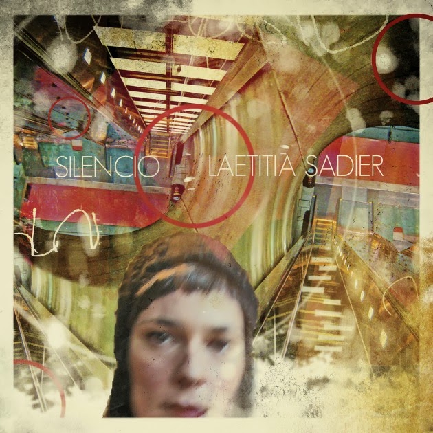
Laetitia also seemed to respond to the intimacy of the venue. She was relaxed and informal throughout, chatting to the audience between songs, each of which she introduced with a mixture of humour and seriousness. Her material was drawn mainly from her recent solo LP Silencio, her second under her own name. There was nothing from the first, The Trip, which was a very personal record, expressing feelings and states of mind particular to that time. Perhaps she didn’t want to revisit that transitional period, and the painful memories which the album dealt with, which belonged to another self. There were no Stereolab songs either. More surprisingly there were none of the French language numbers which make up a proportion of all her albums, which was a shame. She did incorporate several songs from her group Monade, however. This was her project outside of the ‘lab. The earliest of these, Becoming, from the A Few Steps More album, she held to be of enduring personal meaning. It’s one of a number of her songs which deal with personal growth and development, of the continual evolution of the human spirit.

There’s definitely a spiritual facet to Laetitia’s oeuvre, although it remains unconnected to any specific religion. The sense of connection with the cosmos which is a feature of so many of her songs, of the individual finding a sense of belonging within the infinite, is arrived at through the achievements of the human mind rather through any divine intervention. Hers is a humanist perspective on matters of the spirit. That said, the final track of Silencio, Invitation au Silence, finds a sense of the numinous in the coloured, murmuring silence of churches, incorporating a recording made in the St Blaise church in the south-west of France. The irresistible Find Me the Pulse of the Universe from the new album, which we heard on this night, conveys the sense of an unending, questing spirit, and was introduced as a piece of ‘cosmic’ music. Its optimistic launch out into the farther reaches of space was further propelled by the kind of Morricone-esque ‘shum shum’ chorus which has been a feature of her singing since the earliest Stereolab days duetting with Mary Hansen. It’s a music of the spheres rooted in the 60s, that white heat age when the future still invited dreams of endless possibility. Laetitia’s songs often seem to be trying to revive that spirit, to suggest that we can still make a brighter tomorrow.


Between Heaven and Earth verges on Pagan mysticism in its analogy of spiritual being with the growth of a tree, rooted in the earth and reaching half way to heaven. Laetitia’s idiosyncratic phrasing, which takes advantage of her French accent and veers towards a jazzy play with rhythm and emphasis at times, is particularly effective here. Nature metaphors also feature in the Monade song Invitation, from Monstre Cosmic. She introduced this with almost apologetic exaggeration, telling us it was about 15 minutes long and had something like 11 sections. The shifts of tempo, key and mood which it did encompass within its rolling flow reflected the analogy of a life and soul shared to the various stages of a river, which runs its course throughout. She played another song from the Monster Cosmic album, Change of Destination, which had a similar feel. This time, a solitary figure runs and hides before eventually swimming into the deep blue sea into which everything eventually flows. The call and response form of the lyrics, Laetitia answering her own questions, points to their self-reflective nature. Next Time You See Me is another song of spiritual growth, a hymn to the imagination and a warning of its potential stifling. It is also about the power of art to see and depict an infinity of possible worlds. The melody here is instantly and buoyantly infectious, and was co-written with her old Stereolab partner Tim Gane. More wordless vocalising expresses a feeling of effervescent optimism and gladness. The imagery of countless bubbles containing worlds of meaning brings to mind the wonderfully titled Stereolab song Jaunty Monty and the Bubbles of Silence, and perhaps also Tim’s new project Cavern of Anti-Matter.


Lightning Thunderbolt was introduced as a song about desire, as opposed to the ‘cosmic music’ which had been used to categorise other numbers. In fact, it is as much about the meeting of spirits as bodies. It ended with an effects pedal woosh of transfigured sound, and Laetitia looked up with a smile to follow the path of some imaginary spark of essence shooting up into the night sky. Her guitar playing consists of unshowy, solidly strummed rhythmic accompaniment. Referring back to the song Becoming, with its lyrics about the steady and continual process of developing as a person, she admitted that this could refer to her mastery of the guitar too. It was perfectly adequate to the task, however, and was strong enough not to suffer from the lack of an augmenting rhythm section. The output was tweaked here and there with effects pedals which gave a variety of textures to the sound palette.

There has always been a forthright political side to Laetitia’s writing too, stretching back to her contributions to McCarthy in the late 80s. She espouses an idealistic socialism which finds its voice in hymns to collective endeavour and the human spirit, but also in lyrics which analytically dissect the inequities of the late capitalist world. Such concerns are obviously of great urgency in the current climate. Her response to the economic crises, Auscultation to the Nation, comes across as a pointed manifesto, a simple spelling out of evident truths. Auscultation, we were told, is a medical term referring to the process of listening to the body’s organs in order to determine the general state of its health. So, by extension, this was a state of the nation (or a state of the global society) song. The words are clearly and crisply articulated, and are devoid of the poetic ambiguities and elisions which are more characteristic of her writing. It’s evident that she wants to get the message across as directly and unmistakably as possible. It’s to the song’s credit that at no time does it feel hectoring or tainted with bitterness. Blessed with a springy rhythmic drive and light melodicism, it is a light and palatable political address, which nonetheless makes its mark in denouncing the ‘tyranny of money’. It tells it like it is and asks why we should put up with it.

The final song of her set was dedicated to the late Trish Keenan from the group Broadcast, whom she described as her friend. Silent Spot is about someone passing away in their own time, and was thus obviously not written directly with Trish in mind, but the thought was still pertinent. It’s one of a series of songs produced over the years which contemplate mortality, and it arrives at a sense of acceptance, holding out the possibility of some kind of transformation or transfiguration. That sense of the spiritual essence of human being shines through once more. An encore rounded things off on a more upbeat note, and then it was all over. Laetitia retreated to the wings, re-emerging in the bar to sign any records which people might proffer or purchase, or just to say hello. It had been a relaxed and informal evening, and you sensed that she was quite at home in such a low-key setting. She certainly proved that she was a fine solo artist in her own right. The two new songs which she tried out on us (successfully) hopefully point to much more to come in the future.

Thursday, 5 September 2013

Jacques Demy's The Pied Piper (1972)


Jacques Demy’s 1972 film The Pied Piper is a countercultural take on the legend which in some ways comes a little after its time. Donovan’s fey troubadour is a figure from 1967 rather than the early 70s, when the zeitgeist already blew a little more harshly, the idyllic summer a memory eclipsed by subsequent unrest, fragmentation and narcotic drift. The dream of a medieval age of pageantry is thus as much a dream of the 60s ideals which were seeming ever more remote. The generational and ideological divide which marked the decade is here represented by the forces of the church, the armed state and the newly ascendant business class, who are ranged against the artists and philosophers (the peasantry don’t get much of a look in, here). These powerful Hamelin cliques are conveniently colour-coded (although not to the extent of having their faces painted blue or red, as Demy pigmented his servants and soldiery in his 1970 fairy tale Peau d’Ane, or Donkey Skin). The baron and his enforcers wear a mouldy green broken up by sloping military stripes. The cardinals and bishops are wrapped in scarlet, their perspiring faces peering beadily out from capacious hoods. The merchants wear black jerkins (or a more plush red for the higher amongst them) which give them a puffed-out, preening look. The travelling theatre troupe which comes to town have their own loose uniform of striped tunics, but the colours are varied and natural – sky blue, blossomy peach, earthy brown and mossy green. They are colours which reflect the landscape which they pass through, and in which they make their camp each night, and suggest that they are more at home here than in the cities and towns where they go to perform.

Church and state in the appropriate attire - Peter Vaughan and Donald Pleasance
The costumes of the Hamelin worthies are exaggerated and highly theatrical, and make it clear that Demy’s middle ages are defiantly non-naturalistic – a land of fable rather than historical verisimilitude. They are also buffoonish outfits, casting the figures of authority who wear them as grotesques, caricatures of their own warped desires and ambitions. The Burgermeister and his wife’s social aspirations are displayed in the absurd extravagance of the hats they struggle to keep aloft during the tactical marriage of their young daughter to the slimy Franz, the Baron’s son (a mercenary wedding of new money and bankrupt aristocracy). Diana Dors (as Frau Poppendick, the wife) in particular carries spectacularly over-the-top headgear throughout, which she manages to keep admirably well-balanced. The portable marquee which tents her features with such ostentatious modesty early on could be seen as a satire on Hollywood medievalism, with its queens and princesses in conical turret bonnets trailing wafty clouds of gauze. The Baron has a spritish, tapering cap which looks like it's been soaked in algae, or is some fungal growth sprouting from his pate. His bullying son Franz has rolls of green cloth layered in foppish folds atop his floppy, patrician mop. The bishop has his papal hood rising in a mitred, scarlet shield, but his face is also shrouded in a nunnish wimple. These fools’ caps are designed to conceal and disguise, or connote status, but only serve to emphasise the wearers’ vanity, pretension or madness. The players, on the other hand, have loose tunics which hide nothing, and Melius, the alchemist who is the town’s figure of learning and reason, dresses in a simple and noble robe.

At home with the Poppendicks - Roy Kinnear and Diana Dors
The prevalence of British character actors heightens the air of grotesquery. Roy Kinnear, as the Burgermeister Poppendick, brings his usual comic mannerisms into play. He is every inch the businessman who has made his pile through dodgy dealing, and is shifty, opportunistic and completely untrustworthy. He’s also utterly ineffectual as a public figure, and offers muttered asides as to the helplessness of it all. Diana Dors plays his domineering wife Frau Poppendick, one of the bellowing, comic shrews she specialised in during the 70s. She shifts with complete assurance between red-faced shrieking and saucy, winking lasciviousness, and its clear that she’s having a bit on the side with Franz. The thickly curling horns of her wedding bonnet, shaped like indulgent French pastries, seem to mock her cuckolded husband, whose gnomish, priapically extended fez is a pathetically overcompensatory response. Donald Pleasance’s Baron is a mad, muttering recluse, retreating to the shadowy spaces of his castle, and ultimately to the shuttered nook of his coffined bed. His dank lair is covered with morbid murals of devils and skeletons, promising diverse varieties of detailed torment. They are the outward projection of his clammy, twisted mind. Peter Vaughan’s Bishop is a guiltily perspiring serpent, desires as tightly constrained as his face-hugging costume. They are transformed into poisonous bile which his religious authority affords Papally sanctioned expression. John Hurt’s Franz, the privileged scion of the Baron, is poutingly sullen, lighting up only with the sadistic satisfaction he derives from the cruelty which his inherited power and its attendant aura of fear allows him to indulge. All of these exaggeratedly self-interested and power-hungry characters, with their various political ambitions, parallel the powers at play in Ken Russell’s The Devils, released a year earlier in 1971. Russell’s film is entirely dissimilar in tone, but does bear comparison in its use of stylised costume and set design and in its clear parallels with contemporary social, political and military conflicts. Both films are, in their own ways, intensely moral, and unafraid to declare their allegiances, even if this results in a certain schematic division into good and evil.

The Frau and her Franz - Diana Dors and John Hurt
The various powers in Hamelin all have their own schemes, put forward by their leaders. They conspire together in order to realise them, and to maintain their position. Burgermeister Poppendick and his wife wish to graft themselves onto an aristocratic family tree. To do this, they are prepared to marry off their daughter, still a child, to the slimily unappealing Franz. In this way, Frau Poppendick will also have her lover on hand, even if he would by then be her son-in-law. Franz’s aside to the Bishop during the wedding feast makes it clear that he too is fully aware of this, but chooses to tactically turn a blind eye. The sexual hypocrisy of the powerful, who put on ostentatious masks of piety and rectitude, is revealed in the end when Franz reaps his just reward and catches the plague whose proliferation he has enabled. The black circle which almost instantaneously appears on his cheek resembles the patches dotting the faces of the characters in Hogarth’s moral fables; patches which cover syphilitic scars.

Vainglorious dreams - the mad baron and the calculating bishop
The Baron is obsessed with building a new cathedral in Hamelin, facing his castle. This is not so much a monument to the glory of God as a further expression of his power and his preening ego. The Bishop is obviously keen to encourage this, as it would enhance his own prestige. But he is aware that the mad Baron has no practical idea of the costs involved, and the Burgermeister and his guild heads have already taxed every possible local resource. The half-built cathedral façade, with its idle workers and wooden winches and scaffolding, is like an unfinished set. It could perhaps be seen as an admission of budgetary limitations, or as a pointed rejection of Hollywood historical spectacle. The economic exhaustion which the extravagant fancies of the Baron has created has hints of the 70s downturn (although the ’73 OPEC oil hike had yet to make its devastating impact), with images of builders sitting disconsolately inactive about the site striking a resonant note. The rising towers of the cathedral could also be seen as a reflection on the greed of property speculators in the 60s and 70s, erecting grandiose buildings in prime locations and then letting them lie empty for years while they waited for rents to rise, and for sufficiently wealthy tenants to move in. The high-rise modernist office block Centre Point, in the heart of London, was one of the most notorious cases. It lay empty for some 5 years after its completion in 1967 at a time when unemployment and homelessness were rising steeply. The cathedral is only ever seen in the form of its architectural model, or as an elaborate cake produced for Franz’s wedding, another sign of its cynically political provenance. The cake’s delicately iced rose windows and arched doors are shattered by the rats which emerge from within, causing the whole structure to collapse in a symbolic rubble of crumbs and sugary dust.

A higher authority - toadying to the papal representative
A Papal envoy, carried into the town in a palanquin resembling a wooden coffin, is a representative of an echelon of power far surpassing the provincial concerns of the Hamelin elite. His demand for soldiers for the Pope’s expansionist campaigns makes it clear who is really in control, and prompts further scheming. There is no money to pay men to go to war, and not enough of them to spare anyway. Franz comes up with the idea of a children’s army. Their innocence can be exploited by offering them worthless fool’s gold, which he will force the alchemist to forge. Implicit contemporary parallels are drawn with Vietnam, and the young me drafted to fight there. With the arrival of the rats and the panic over the spread of the plague they bring in their wake, the cynicism and self-serving actions of the Hamelin authorities reaches a new, murderous pitch. Franz’s insistence that Melius, the alchemist and apothecary, devote his attentions to the creation of the fool’s gold for his children’s crusade rather than concoct a preventative medicine to protect against the plague shows a willed blindness. It’s a blindness which gives precedence to short-term capital gains over the management and care of the natural environment. Again , a concern very much in tune with the times, and the dawning awareness of impending ecological crises. The dark and unsparing representation of the hypocrisy and viciousness of power which lurks behind the grotesque surface of the film’s colour-coded villains reaches a climax with the burning of Melius at the stake. His heresy is the assertion that the plague is caused by natural means, and can thus be cured by natural methods. The Church claims it is a curse sent by God, and rests its authority on such a position. The Bishop is not about to have his authority challenged, and pronounces sentence with scarcely a moment of reflection. He is backed up by the Baron and Burgermeister, Church, State and Commerce uniting to serve their own interests. Demy displays a subdued sense of rage against his authority figures throughout, but it bubbles to the surface in the final scenes. His fairy tale certainly possesses a very adult subtext, engaged and angry. It has some of the spirit of Angela Carter’s worldly recasting of the old stories – sharp and wise.

On the borders of elsewhere - the magical storm
The cast of fairy tale villains, shaded in contemporary colours, are given particular prominence in Demy’s sombre fable. But we start with the wagon of a travelling troupe of players trundling across the countryside, the painted cloth backdrop of a beatific female martyr smiling in the flames like a bright sail helping them along the way. The painting is almost like a precognitive representation of Joan of Arc, who was burned at the stake in 1431, many decades after the mid-fourteenth century setting of the film (the post-credits historical screed informing us that the year is 1349). They pick up two further travellers as they approach Hamelin: a peddlar pilgrim, hawking relics and crusade souvenirs; and Donovan’s mysterious troubadour, the sharply pointed prow of his cap shading his gaze. The piper’s fey, otherworldly character is underlined by the magical storm which flashes around the encampment the night after he joins them. Theatrical lighting illuminates the stage set, its artificiality lending the scene an eerie charge, as if we were on the borders of some otherplace. This motley group are strongly reminiscent of the wandering players in Ingmar Bergman’s The Seventh Seal. They too are seen as innocents, free from the corruption of the world they move through and open and generous to those they meet. The pilgrim offers a more worldly perspective akin to that of the knight’s squire in Bergman’s film. They are a band of outsiders, whose lowly, vagabond status is made abundantly clear to them as soon as they arrive at the gates of Hamelin. The bawdy, knockabout popular entertainments they put on in front of their large Marian screen purvey a different, more honest and open vision of the sacred to that put forward by the Church. It’s a vision which finds the sacrosanct present in the common experiences of everyday life, in the pleasures which the Church would taint with sin.

Subversive art - the players' backdrop
There’s also a subversive element to the players, a mockery and peasant disregard for authority which anticipates non-conformist beliefs to come. The backdrop with the burning female saint has an enthroned king to the side gesturing his approval whilst a flunky does the hot and dirty work and fans the flames to enhance the spectacle. The woman’s sanctity is made evident by the golden headdress of her halo and the angel reaching down her hand in preparation to usher her into heaven. The king and the state he commands is thus portrayed as the villainous party, creating martyrs of holy innocents. In the show they put on outside the walls of the town, silent comedy angels suspended in the air (flying Keatons or Chaplins) deliver boots up the backside to prowling baddies who look suspiciously like castle guards. Again, there are parallels with The Seventh Seal. In Bergman’s film, the players’ life affirming farce is disrupted by a procession of self-flagellating penitents, who oppose it with their own theatrical spectacle of wailing and suffering. In Demy’s film, the players put on a show for the wedding feast which makes play with the story of Eve’s temptation of Adam. Here, a giant hopping apple and a frustrated serpent arrive too late to perform their assigned roles. Eve is beaming and caressing her rounded belly while Adam stands to the side, looking very pleased with himself. There’s no hint of sin or shame in this Garden, over which the painted figure of another female figure looks with an approving eye. The players and artists are associated with a more Marian worldview, heralds of a female future in which male power holds less sway. This is in marked contrast with the Bishop’s wedding ceremony, during which he venomously hisses about Eve’s curse and voices the Church’s abhorrence of female sexuality.

Songs for children - Donovan plays real good for free
The players remain essentially peripheral to the story, however, never becoming directly involved in its unfolding intrigues. Even the pied piper is a rather shadowy presence, a keenly observant onlooker from the wings who only takes centre stage to perform his three significant acts of musical enchantment: the waking of the Burgermeister’s daughter from her trance; the herding of the plague-carrying rats to the watery end; and the leading of the children in a merrily dancing parade to elsewhere. In a way, he is a little like Bob Dylan’s character in Pat Garrett and Billy the Kid (although a lot less twitchy) - the artist observer, taking in what he sees and storing it for future use. In the Pied Piper, however, Donovan’s songs are directly incorporated into the story rather than serving as its background soundtrack. Donovan’s piper is a figure from beyond time. Whilst the theatrical band take up hurdy-gurdy, cittern and tabor to play through a medieval estampie dance, he carries his psychedelically daubed acoustic guitar and sings songs which could have been taken from Donovan’s own albums for children, HMS Donovan and For Little Ones. Songs steeped in 60s Pre-Raphaelite medievalism like Guinevere and Celeste make him something of a natural for such a role, and he would go on to write songs for Franco Zeffirelli’s portrayal of St Francis as hippy saint, Brother Sun, Sister Moon.

The relaxed and industrious home - Melius and Gavin (Michael Hordern and Jack Wild)
The central characters outside the conglomerate circle of villainy, however, are Michael Hordern’s Melius, the Jewish alchemist, and his surrogate son Gavin, played by Jack Wild. Wild brings some of the urchinry he put to good use as the Artful Dodger in Oliver to the character. But here he has a settled home and a scholarly Jewish guardian with his best interests at heart. Melius’ laboratory cum library is a far more welcoming home than the Baron’s forbiddingly dark and labyrinthine castle. It’s filled with light, books, pots and bottles, alembics, bird cages and curios (preserved crocodiles and turtles) which suggest a lively curiosity about the wider world. Its busy but relaxed atmosphere is in complete contrast with the morbid interiority of the Baron’s gloomy surrounds, or the fussy quarters of the Burgermeister and his wife, where harried servants are constantly having orders shouted at them. Melius and Gavin offer an alternative vision of family life, one which doesn’t involve direct descent, but which does involve a great deal more love.

Morbid interiors - the Baron's decor reflects his mind
Where Baron and Burgermeister use their children as bargaining pieces to gain position or wealth, Melius seeks to guide Gavin towards the fulfilment of his nascent artistic talents, pointing him towards the Netherlands and the new schools of secular painting emerging there. This was the time leading up to the establishment of the Flemish School under the patronage of the Duke of Burgundy in the late 14th and early 15th centuries, which would reach a pinnacle with the paintings of Jan van Eyck and Rogier van der Weyden, and a little later the densely populated fantasias of heaven and hell by Hieronymous Bosch. Gavin makes a connection with the visiting players, recognising fellow spirits from whom he might learn. Demy depicts his artists as outsiders, looking in on society from a slight remove. There’s obviously a fair degree of self-portraiture here. These artists are either a part of a group, have the support of a sympathetic patron (Melius in Gavin’s case) or are loners who follow their own muse (Donovan’s piper) and who seem to be not just outside of society but from another world entirely. At the end of the film, Gavin return disconsolately to Melius’ room. It’s still filled with the objects which mirrored the contents of his mind, but its now empty of his spirit. He takes up the pipe and begins to play, and when the players turn up and invite him to join them, he agrees with scarcely a moment’s hesitation. He will travel to the Netherlands, explore new art forms and perhaps attain the almost supernatural power of the piper. A power which is achieved through art or music rather than sorcery, however.

Pleading with power - Melius and Franz
Gavin is also in love with Lisa, the Burgermeister’s daughter, and has secret meetings with her in the enclosed garden of her house, as if they were characters in an Arabian Nights tale. The scene in the garden is one of sun-dappled innocence, the two children finding a moment together in a private paradise before going back out into the fallen world. They are like a new Adam and Eve in this corrupt and plague-ridden land, offering the possibility of a new start. The contrast between innocent youth and debased maturity reflects the exaggerated generational divide of the 60s, a divide which was viewed by some in morally absolute terms. It is the elder Melius, however, who takes up the countercultural cry during his trial, holding out hope for an alternative to a deadening world of grubby power play, materialistic greed and oppressive religion. In what amounts to an explicit statement of Demy’s creed, he looks forward to a future in which we will have learned ‘to tolerate each other’s differences…and even to rejoice in them’. His words are met with snarls and sneering looks of contempt from his accusers. Melius is the outsider within the town walls. He is visibly different in dress and physical appearance, and also suspicious in his book-learning, independent of any institutional support and sanction as it is and thus betokening a dangerous freedom of thought and belief. His is potentially the rational voice of scholarly reason, free from the distorting gravity of power. But the pull of that power on weaker minds proves greater than the vital need for truth, and his fate is thereby written and sentence passed. At the same time, the Hamelin authorities’ willed ignorance condemns the greater part of their town to death.

The one that got away - the piper and the rat
Melius’ dawn execution forms the climax of the film. As he is led to the stake, the piper takes up his recorder once more and begins to draw the children from their early morning beds. It’s a symbolic awakening, leading them into a new dawn whilst their parents sleep or watch the execution, and is in contrast with his enchantment of the rats, which took place in darkness, with the powers that be looking on. Here, the gloomy, benighted world is being left behind even as its violent authority becomes more overt, made manifest in the daylit town square. Donovan’s piper leads the children away from Hamelin, from the sight of Melius’ burning, from the plague, from conscription into foreign wars, and from a future of political oppression and religious persecution. They dance out of the town and into the meadows beyond, singing and playing instruments. Gavin struggles to keep up with them, desperately calling out for Lisa, but to no avail. And then, in the blink of an eye or the splicing edit of a frame, they disappear in a solar flare of lens glare. The piper’s act is seen as one of salvation rather than of terrible revenge for the duplicity of the burghers in not paying him for ridding the town of the plague rats. This mercenary aspect to the old tale is not a significant factor in the film. When the payment initially agreed upon is refused, and the piper turns down a derisory alternate sum offered by the Burgermeister after the rats have been washed away in the river, his reaction is akin to a shrug. It’s as if this was no more than he expected all along. His salvation of the town from the plague is instantly forgotten, the onlookers drifting off with little more than awkward and muted thanks. He communes with a single rat which has been left behind, just as Gavin will be at the end. His otherness is further evinced by the genuine empathy he seems to exhibit towards this reviled creature. It’s an exchange which seems more genuine than those he’s had with the humans he’s encountered here. But his reaction is one of sadness rather than anger or disgust, and gives an insight into his motives for leading the children’s parade at the end.

The pied piper's parades - through the dark town with the rats...

...and out into the dawn meadows with the children
His enchantment of the children occurs as a direct reaction to Melius’ imminent immolation. We don’t see where they go; some fairyland equivalent of Gavin and Lisa’s garden, perhaps. But they go there full of joy, singing and dancing. And anywhere is better than this world, it is suggested. Franz, supervising the execution, hears the flute’s dancing pastoral melody drifting off in the distance, and feels an instinctive loathing for its light-hearted, optimistic airiness. He drowns it out with a music more in tune with the world which he intends to build with his commercial and ecclesiastical allies – the uniform, martial beat of his guards’ snare drums. The pre-final credits historical summary, setting the film in context in classical Hollywood style, looks forward to the atrocities of the religious persecutions and inquisitions to come, which Melius’ execution anticipates. With the statement that they would ‘remain without parallel until this century’ we are brought into the present, and the contemporary relevance of this fable is made plain. The bowl of the guards’ helmets has a stormtrooper curve, with horned metal spikes at the sides giving it an extra satanic embellishment. The execution of Melius’, the Jew, and the suspicion cast upon the players, who are referred to contemptuously as gypsies, bring to mind Nazi genocidal murder and the repeated demonising of outsiders and ethnic groups as a verminous ‘other’ throughout history. The chaos which descends on Hamelin at the end of the film, with people leaving on wagons piled high with their belongings, also brings to mind the mass displacement caused by warfare, ancient and modern. If the piper has led the children away from the world until it is a fit place for them to live in then, Demy suggests, that world has not yet come into being. In some ways, then, this is another 70s film about the failure of the 60s countercultural dream. It’s a sobering conclusion to this brightly coloured fable with a heavy and brooding heart.

Back to the garden and out of the world