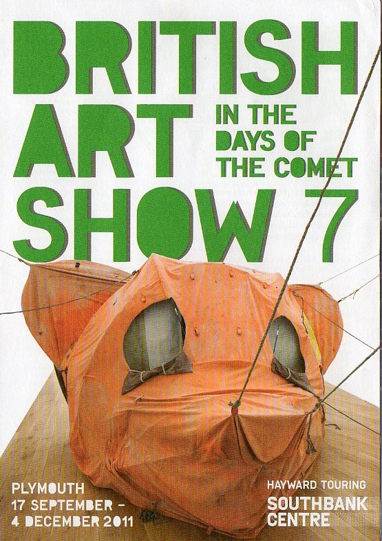
 A short stroll around the corner from the Plymouth Museum and Art Gallery brings you to the Plymouth College of Art. Here, Edgar Schmitz once more provides spacey sounds and a nebulous visual loop at the threshold, ushering us into a space apart from the familiar world outside. Brian Griffiths’ sculptural installation is pitched in the gallery, a ragged and mouldering canvas strung from wall to wall, filling the space. The tent is formed into the shape of a bloated, decaptitated head, with eyes slashed in front and ears and muzzle pinned out by taut guy ropes. It looks like the flayed and padded hide of a monstrous Mickey Mouse. Grubby and faded, it is a totemistic object grown sinister through repeated use, now exuding an air of diseased malignity. The dark, gaping holes of its tent flap eyes and its dumb, mouthless muzzle make it look like a death mask, a grotesque taxidermic imitation of life. Campers’ badges sewn onto the back trace a ritualistic trail of towns and cities through which this sick visage has toured, infecting them with its grim, nihilistic stare.
 The next venue in the Show’s tour of the city is the Plymouth Arts Centre. To arrive here, you have to cross the permanently busy roads which circle the central boulevard of the post-war city plan, skirt the bizarre assemblage of off-kilter and wholly unrelated decorative facades which front the Drake’s Circus Shopping Centre, pass the bombed out church now marooned on a traffic island, and descend through an underpass and into the stained concrete grottoes of the bus station. The Arts Centre is housed unobtrusively in a couple of terraced Georgian houses on the outskirts of the Barbican area. Down in its basement gallery a selection of drawings Mick Peter and Alasdair Gray. Peter’s work tends to be split into two panels, akin to the layouts of comics. The drawings themselves also share the boldly outlined forms of comic book imagery, with a similarly limited colour palette, in this case red and black. This gives them a direct immediacy, together with a vaguely propagandistic look. There is continuity between the panels, but the division marks some transformation or shift of emphasis, which makes for a contrast between upper and lower sectors. In Talbot’s Room, an impossible tree house is perched on a flimsy upper branch of a leafless winter tree, reached by a long, spindly ladder which is itself planted precariously on the roof of a dilapidated shack. The shack is elevated on makeshift scaffolding, tilted along the incline of a steep slope down which it looks likely to toboggan should one of its unstable frame of criss-crossing props be knocked away. The whole structure is a study in tenuous and provisional balance, subject to complete collapse at any moment, and held up more by hope more rational and skilfully realised design. In the upper panel, two bare branches of the tree extend, their jagged lines expanding to form two roughly sketched eyes which look like they might have been extracted from a protest banner or poster, daubed on with urgent vitality. All the dangerous, makeshift architecture and hazardously knocked together platforms have been created in order to ascend to the perspective of this elevated, godlike vision. In another picture, a country stile straddles a dry stone wall, which has been constructed with whatever mineral materials lay close to hand, its haphazard form a matter of expediency. It is a jumbled assemblage of different shapes, sizes and textures, chaotic but nevertheless interlocking to create a temporarily stable order. The two upward pointing poles of the stile extend into the upper panel, and following the line of one, like following the end stars of the Plough to find the pole star, directs our attention to a hovering object floating weightlessly in the sky. It is the hollow framework of an open-sided dodecahedron, one of the ideal Platonic solids, its pentagonal shapes folding together in perfect symmetry to create a twelve sided geometrical object, a reflection of changeless heavenly order. This contrasts with the cluttered scree and timebound regolith of the earthly flux below, fashioned by human hands into more contingent and changeable patterns.
 The author, playwright, poet, essayist and artist Alasdair Gray was represented by seven of his portraits, whose simple and boldly outlined bodies and features and striking colour contrasts made them the perfect partner for Peter’s drawings. The economy with which he conjures the character of his sitters (and they do tend to be seated) and the broad areas of clearly defined colour with which he surrounds them, making them stand out all the more assertively, reflect his longstanding preference for painting murals, which have graced various sites around Glasgow, from synagogues to chip shops, churches to underground stations. This economy of effect also echoes the clarity of his precise and uncluttered prose. The subjects of these portraits are a mixture of friends, literary acquaintances, and models from Glasgow School of Art and elsewhere. Two are taken from a series of studies he made of may Hooper, who modelled for him in 1984, and for whom he seemed to feel a particular affinity. In his book A Life In Pictures, he remarks that he intended to fill a small book with portraits of her. He also notes that he used a thick-nibbed fountain pen, which allowed him to vary the thickness of the outline and thus suggest the solidity of the body without recourse to shading, which would intrude upon the simplicity of the drawn figure.
 May In Black Dress on Armchair portrays her in the same manner familiar from the strong women of Gray’s fiction; calm, assured and relaxed, with hands folded in her lap and head resting lightly but alertly on the back of the chair. May On Invisible Armchair finds naked, her support magicked away from beneath her, floating weightlessly on the aether. Gray surrounds her with monotone background of blue acrylic, as he does in the previous portrait, which here makes it look as if she is ascending into or floating upon the summer skies. It is evidently an element in which she is comfortable, her passage through it effortless and natural, raising a quiet smile of relaxed pleasure. The tone of her flesh derives from the unadorned manila brown of the wrapping paper which Gray has used, enhanced by the contrast with the enveloping background colour. He has often used unconventional surfaces to draw and paint on, seizing upon whatever was readily available, whether it be wrapping paper, newspaper or the reverse side of wallpaper rolls. He admits, in the autobiographical book gathering together a generous selection of his art A Life In Pictures, that ‘even nowadays, when I can afford good quality cartridge paper, it still makes me uneasy and self-conscious because too expensive to risk spoiling’. The unconventional materials are put to imaginative and idiosyncratic use, their particular colour and texture lending their own quality to the picture where the surface is allowed to nakedly reveal itself. It perhaps even helps to suggestively hint at the direction the composition might take, in much the same way that the shape and texture of the walls, floors and ceiling of a building would guide the form of his murals. The May pictures were completed in 2010 (‘with the support of my recently acquired art dealer’ as Gray lets us know in A Life In Pictures), a lengthy gestation period from their original drawing in 1984, which may be partly down to a certain reluctance on Gray’s part to bring a work to a definitive conclusion, partly due to the conflicting demands arising from endemic impecuniousness, and partly due to an abiding anxiety about possibly spoiling the effect of the original drawn delineation of the figures with further detail and colouring.

Alasdair Gray - Andrew Gray Aged 7 and Inge's Patchwork Quilt (copyright the artist)The portraits often incorporate carefully stencilled words marking names and dates which, along with the details of dress and furnishings, act as memorials of a moment or a very particular time and place. In the case of the picture Teacher, Historian, Poet, Angus Calder, this acts as a final memorial, the dates 1942-2009 marking the span of his life and the portrayal of his final days lending him dignity in death. The words on the pale chalk blue of the background (the fading world) give the portrait context, telling us that Calder is ‘in an Edinbourg care home where he died, and is here murmuring recollections of Nairobi University’. From the bedbound constraints of the end of his life, he travels back through the expansive continents of his memory. It’s a compassionate and calm portrait, a visual obituary tribute which asserts that character and personality persist right up until the end. Blue Denim, Christine and Dan Healey, Rex Scotorum has both the title subjects sitting calmly at a table, straight and upright as if enthroned and facing their courtiers. He is nude and potbellied, folded hands covering his modesty, head topped with a crown and long beard trailing in sinuous lines – A very Blakean figure. Mick Broderick, painted in 2008, sits in a chair, but has none of the relaxed, easeful presence of May. He is serious, guarded and wary, with arms and legs defensively crossed. His face looks out at us from an indirect angle, and with a suspicious cast to the features, eyes giving a sidewise glance of measured appraisal. The portrait of Alasdair and Ann Hopkins proudly declares its delayed period of completion, the words Drawn 1982: Painted 2009 inscribed on the background. The subjects sink side by side into their sofa, he relaxing with a whisky, she cradling a blissfully dozing white cat in her lap, a picture of domestic comfort. The cushion provides an area of colourful patterning, which can also be found in curtains and carpets and clothing in other pictures. In Andrew Gray Aged 7 and Inge’s Patchwork Quilt from 2009, this patterning resides in the coverlet which shares equal top billing with his son. This is a memory piece, with detail recollected from decades ago, revivifying the quilt, which glows with the freshness of new creation and what Gray describes in A Life In Pictures as ‘the bright heraldic colours I most enjoyed’; Colours which once more recall the vivid immediacy and striking impact of his murals.
 The final part of the Show takes you out of the city centre and, if you choose to walk, leads you on an interesting trail across the Hoe and around the back of the Mill Bay docks, where bundles of coniferous tree trunks always seem to be in the process of being loaded or unloaded. You cross over into the Stonehouse area of the city via the imposing 18th and 19th century grey stone blocks of the marine barracks, wend your way through neat rows of early 19th century terraced houses until you come to the grand arch, bestrode by a triumphant 13 foot statue of William IV, which leads into the Royal William Yard, built between 1825-33 and ‘by far the most impressive single architectural group in Plymouth’ according to Nikolaus Pevsner. The extensive compound was created according to the needs of the Victualling Board of the British Navy in order to provide its sailors with the food and drink they required, and have a place to preserve and store it. Of the various old breweries, bakeries, mills and storehouses which have now been converted to flats, offices and restaurants, the exhibition took place in the connecting halls of the slaughterhouse, where up to 100 cattle met their end every day in the mid 19th century (memorialised by a couple of carved bulls heads on the rear of the entry arch) – an appropriate setting for the cutting edge of modern art, although thankfully there are no butchered Hirst beasts here.
Mick Peter in the slaughterhouseThe first thing which draws your eye when you walk in is Mick Peter's large, bright red sculpture, which looks like it might have been dipped in a vat of fresh blood, and which contrasts strikingly with the grey stone walls. Its singular primary colour gives it some sense of continuity with his red and black drawings seen in the Arts Centre. He has modelled a couple of architect’s tables, raised to a vertically sloping angle. The sharp points of set squares are embedded in them, as if they’ve been thrown like darts, and they stick out like the fins of geometrical sharks. What looks like a half-melted saw forms an undulating bridge between the two separate tables, linking them like the hemispheres of the brain. These objects, normally solid and the bases for creating structure and order, seem soft and mutable, caught in the act of imitative transformation, or at the beginning of the process of changing into something wholly other. You sense that its colour is one thing that it can’t alter, however. Opposite is a standard laminated metal bench of the sort commonly found on railway stations, seemingly constructed with the deliberate intention of denying anyone the chance of getting too comfortable. At one end, the plastic lamination has been burned away, leaving a scorched circle of metal. This is because, at certain intervals, a naked man walks by and sets a small fire at one end, perching on the other to watch its chemical flames. The whole then becomes the stage for a sculptural tableau, with contrasting elements of flesh, metal, plastic and fire. It is the work of , who in 2008 created , and incredible installation for which he filled an empty flat with liquid copper sulphate, which covered its surfaces with deep blue crystals, turning a very ordinary locale into a glittering, enchanted cavern. This was a similarly startling and imaginative idea, but the naked man failed to make an appearance whilst we were there, so it remained in ideal form only.
Haroon Mirza has constructed an audio sculpture made up of discrete elements which nevertheless connect with each other to make a unified whole. Various media through which music and sound can be played are brought to bear. A record player spins the Joy Division LP Unknown Pleasures, identifiable through its label, with its pulsar waveform mountain range. The needle is kept stuck in the playout groove by a sticker, which acts as a buffer, creating a rhythmic loop of crackling white noise. Another, tilted, turntable slowly turns, the elevated record balanced at the tip of its spindle acting as a cog which connects with a long dangling flex from which a naked lightbulb is suspended. The record carries the lit bulb around in an elliptical revolution, is if it were part of a phonographic orrery. The bulb passes over a transistor radio, tuned between stations, causing it to emit bursts of hissing static with its 40W solar flares – the sound of the universe’s background radiation, a more chaotic music of the spheres than that envisaged by Pythagoras. Another record lies flat on the top of a spindle, slowly revolving, a black vinyl plinth awaiting some heroic statue or fetishized commodity display. The back of a pick up arm abrades it from below, creating grinding repetitive noise rhythms. Behind the cluster of gramophones, a CD player rests on a tall stack, its disc skittering through a digital stutter which never manages to resolve itself. The media of tape and television are covered by a recorded performance of Samuel Beckett’s Krapp’s Last Tape played on an old set, the volume turned down to render the old man and his spools dumb. The screen points away from the other elements, leaving Krapp in circumscribed, self-created isolation. The whole assemblage is occasionally flashed with strobe lighting, a reference to Joy Division lead singer Ian Curtis’ epilepsy, which the artist himself has also suffered from in the past.
The Otolith Group consists of artists Anjalika Sagar and Kodwo Eshun (can two people really be considered a group? Perhaps the Otolith duo sounded a little underpowered). They have made a short film called Hydra Decapita, which combines various layers and interposed stories and narratives to make connections between the Atlantic slave trade, art and imaginative fictions of escape and historical reconfiguration. Atmospheric film shot along the rocky coastline of Cornwall evokes the sublime terror of the sea and creates an ominous backdrop to the event which is the historical crux of the piece: the throwing overboard of 133 slaves who had fallen sick from the Zorg slave ship, in order that the company could claim insurance for the loss of a now devalued cargo. This is linked to Turner’s 1840 painting Slavers Throwing Overboard the Dead and Dying – Typhoon Coming On, which the Victorian critic John Ruskin extolled in his 1843 volume Modern Painters. Eshun talks of Ruskin defending and celebrating this painting. I’m not sure whether he means on a formal level, or whether he is implying that the picture is somehow in itself part of the fabric of the slave trade (which had recently been abolished in most of the British Empire at this time) and its justifications. Selected lines from Ruskin’s review are sung by Anjalika Sagar, expressing the sublime beauty of Turner’s painting, which seems to suggest that the suffering of the slaves is ignored. A more complete and representative quotation from Ruskin’s writing would have made his feelings about the subject clear. He goes on to set the ‘nobility’ of the painting in a moral context, suggesting that the tempestuous elements are ‘advancing like the shadow of death upon the guilty ship as is labours amidst the lightning of the sea, its thin masts written upon the sky in lines of blood, girded with condemnation in that fearful hue which signs the sky with horror’. The romantic sublime here is a terrifying, engulfing force to which the slaves have been thrown, and the arm and chains sinking below the waves in the foreground, lit by the glow of the setting sun, raise explicitly accusatory hands which gesture towards the slave ship departing on the horizon. It is a picture full of pity and horror, the latter perhaps made a little too explicit by the exaggerated monstrosity of the giant fish which gather for the feast – but exaggerated effect is part and parcel of propoganda. Ruskin was given the painting as a present, but later sold it because he found it ‘too painful to live with’.

Hydratic worlds - return to DrexciyaThe Otoliths draw on the mythologies behind the music of Drexciya, a duo who emerged from the Detroit techno scene and shared its science fictional imagination. They invented an aquatic world, Drexciya, into which the offspring of the drowned slaves were born, a fantasy of escape which rewrites history. This is elaborated into an alternate cosmology here by a voice filled with a rather desperate stridency, cryptically identified as Remnant of a Hydrogen Element. He is heard spinning assertive theories and stretching the boundaries of scientific credulity whilst the camera remains still within a womblike cave, looking towards its curved mouth; a place of safe retreat from which to be reborn into a newly created world. The voice talks of a waterworld surrounding a star in a vast shell, insisting that this is possible, as if conviction is enough to make it manifest. Another, more resigned voice sends reports from some future moment, possibly in a post apocalyptic or politically oppressive world, her attempts at making sense of recorded archives appearing as semi-coherent text on the screen. There are also interludes in which we see flowing water shot in extreme close-up in such a way that it resembles flashing, glinting streaks of light. These appear like background static initially, and are accompanied by the detuned white noise of coded numbers radio stations. Just as voices emerge from the background sound, so the visual static resolves into the chaotic flow of water, noise resolving into comprehensible signal in a way that echoes in microcosm the complex elements of the film as a whole – although the degree to which meaningful pattern becomes apparent may well differ from viewer to viewer.
One Work: An Exhibition for Modern Living by tvnportal
Matthew Darbyshire’s An Exhibition for Modern Living creates an enclosed show room within walls of white shelving and fills it (and the shelves) with exemplary domestic objects reflecting the taste for shiny, mass-produced glitz and glamour, a collection of glittering totems of lightly held values. Artificial and cheaply manufactured materials predominate, with plastic, chrome and porcelain the smoothly presiding textures. There are pink curtains, a pink felt-lined phone, an array of plastic hourglass drum stools, a curtain of trailing gold discs, paper globe lanterns lining the floor like beached bouys, neatly paired and laid out designer trainers, a gold lame jacket hung up ready for a night out, white and pink elephants, and a sequined union jack cushion. White ceramic Buddhas, pink felt Christs and a gold-plated Ganesha point to a shallow and bogus religiosity which has been reduced to cheap commodification, consumer icons in this temple of kitsch. The title of the installation is taken from a 1949 exhibition which sought to point the way towards a bright and rational post war modernist future in which new design would create the shape of a new world. Such dreams of modernist purity have been transformed into the jumbled variety of objects on display here, which are possessed of a uniform characterlessness despite their seeming diversity, and form part of a comfort zone of reassuring blandness. In the centre, a chair rests on a small patch of artificial grass, a parodic fragment of the pastoral in this denatured, anaesthetised Eden. On the other hand, you could view it all as being just a load of camp fun, a counterblast to modernism’s earnest seriousness and lack of visible humour. The smooth, soft-edged, and shiny lightness of its squared off space and contents makes a notable contrast with the rough hewn grey stone walls with surround it. It seems that it is this enveloping colourlessness and incipient, cheerless gloom (these are the walls of an old slaughterhouse, after all) which it is trying to fend off with its distracting surface sparkle.
The final work which you come to in this part of the Show is Christian Marclay’s The Clock, an appropriate point of culmination given the widespread acclaim that it has garnered, including winning the prestigious Golden Lion at the Venice Biennale art exhibition. It’s a 24 hour film collaged from myriad movie and TV clips, all of which contain some reference or allusion to time, and the appearance of clocks and watches in many of which (observed or unobserved) is synchronised with the actual time of its projection and viewing. If a character on screen checks his watch and sees that it is 10.30, you can do the same, and find that the time actually is 10.30. It’s an idea which needs no justification, exerting its own absorbing fascination and being sheerly enjoyable in its own right. It throws up odd juxtapositions of genre, era and mood, and reveals the central role which time plays in the movies, and the kind of scenarios in which it’s an important factor. Westerns include a good deal of waiting, a natural enough consideration given the difficulty of travelling to and from the minimally civilised outposts of the wild frontier. Railway stations are also a recurring location in which time and waiting are inherent, and in which clocks are naturally prominent. There are many films in which a rendezvous is set, and we share the tension of a character wondering whether it is going to be kept or not, with nervous glances at the advancing minutes. Ticking bombs and hostage situations, or any scene involving a countdown or deadline, have a more urgent timebound tension, with clues having to be uncovered and solutions hunted down within a prescribed period. The film develops its own rhythms, with periods of relative inactivity and reflection punctuated by bursts of more frenetic action. Morning, afternoon, evening and night all have their own filmic moods and atmospheres, and different genres tend to find their own natural time of day to inhabit and come to life in. Certain key times suggest themselves; it would certainly be interesting to see what happens around midnight and during the witching hour. We saw a segment lasting from 4.30 until 5, a period which sees the end of school and of office hours, with the resultant anticipation of being liberated from routine and preparing for the excitements of the evening ahead.
The Clock is, above all, a gift for the film buff. The buzz of recognizing favourite films, or the vexation of trying to recall just where this or that scene comes from is a real pleasure for the cineaste, as is the anticipation of what will come next, or when certain moments will turn up (what was the time when Harold Lloyd was hanging from that clock face? And what did Peter Fonda’s watch say at the moment that he dashed it to the ground at the beginning of Easy Rider, rejecting the constraints of time?) Whilst we were watching, there was a wildly disparate range of films and actors. Denzil Washington was sitting moodily, waiting for something or somebody, at various points throughout. There were scenes from Jim Jarmusch’s Coffee and Cigarettes and Mystery Train, characters tending to a good deal of hanging out in his films. Shelley Duvall turned up in Robert Altman’s Three Women and Thieves Like Us. Humphrey Bogart waited in vain for Ingrid Bergman at a Parisian station in Casablanca, whilst elsewhere the 4.50 from Paddington was expected in the eponymous Agatha Christie adaptation. People also waited for trains to arrive bearing fateful passengers in High Noon and Once Upon A Time In The West. Ingrid turned up again in Gaslight, worrying that she was losing her mind as details of her house were subtly altered around her, whilst Betty Davis prepared some domestic mind games of her own in Whatever Happened to Baby Jane. Both Dickie Attenborough and Dirk Bogarde leave buildings in fifties or early sixties England, looking shifty and checking the time. George Chakiris from West Side Story can be seen mooching around at various junctures, looking unreal and airbrushed in Technicolor tones. We voyeuristically follow John Lithgow’s killer in Brian de Palma’s Blow Out, his murderous garrotte extending from his watch and thus affording us frequent glimpses of the time. We see Jean-Pierre Leaud grow up, playing Antoin Doinel as a boy in Truffaut’s 400 Blows, and as a young man dodging the Parisian traffic in Stolen Kisses. Jack Nicholson clock watches his final few office minutes away until retirement in About Schmidt, whilst Steve Martin endures the agony of waiting for his dithering boss to come to a decision, acutely aware that his chances of catching the flight he’s booked on are narrowing by the minute in Planes, Trains and Automobiles. Maggie Cheung sways along the street in Wong Kar Wei’s In The Mood For Love, a film which seems to unfold in a permanent state of temporal suspension. Juliette Binoche potters about in her Parisian attic room in Alice et Martin, and Peter Cushing leans against a fireplace in an elegantly appointed Victorian parlour, waiting for someone or perhaps just musing. Christopher Lee, meanwhile, takes measured steps away from Roger Moore in The Man With The Golden Gun as they pace out an old-fashioned duel. Robin Williams sits in his study waiting silently for Matt Damon to open up in Good Will Hunting, and River Phoenix stares out over the desert horizon I My Private Idaho. A young Mel Gibson races up and down the trenches at various intervals in Gallipoli, finally arriving just too late to deliver his most vital message. Timothy Spall sits in his stationary taxi, staring out at the world beyond his windscreen in a daze of uncomprehending disconnection and dull depression in Mike Leigh’s All Or Nothing. Patrick McGoohan tries to convince disbelieving onlookers that they are about to get blown up by a bomb. John Simm’s Raskolnikov tries to sell his watch to the old pawnbroker he will murder in Crime and Punishment. Robert Redford manages to stop time, smashing the stadium clock with a mighty slow motion stroke of the baseball bat in The Natural. Bank clerks wait for closing time in an episode of The Twillight Zone, whilst Christopher Reeve and Jane Seymour pass the time on a warm summer’s day in the shade of gazebo in writer Richard Matheson’s Somewhere In Time (just having a title which references time is sometimes enough to warrant inclusion). The time to come flickers in LED digits on the dashboard of Harrison Ford’s ascending car in the future city of Blade Runner. And so on.

Controlling time - The Thief of BagdhadIn a key thematic scene from Alexander Korda’s Thief of Bagdhad, Conrad Veidt’s crafty vizier Jaffar explains to Miles Malleson’s foolish sultan why his new time-telling toy is such a potentially ruinous and revolutionary invention. ‘I hope this dangerous device will never be allowed into the hands of the people’, he pointedly muses. ‘If people once begin to know the time, they will no longer call you the king of time. They will want to know how time is spent’. ‘Oh you’re right’, the sultan witters, ‘the people must never know’. Time is money and its possession is power. As we approached 5 o’clock, this particular section of The Clock’s 24 hour cycle built to a climax with the final duel from Sergio Leone’s For A Few Dollars More. Lee Van Cleef’s Colonel faced off against Gian Maria Volonte’s psychotic bandit Indio, with Clint Eastwood acting as rifle-bearing arbiter, opening the stopwatch which has been a central motif throughout and setting off the melancholy music box waltz the cessation of which marks the point at which the gunfighters may open fire. The usual Leone play of wide angled shots moving in to close-ups of narrowed eyes and twitching fingers is intercut with various scenes of individuals and groups waiting and watching in a state of suspended anticipation. Many of them have been encountered already in the last half hour (there’s Denzel again). It grants the ritualised duel in the middle of a desolate nowhere a large and rapt audience, where usually only the man with no name is present as a taciturn and expressionless witness. It’s an inspired piece of editing, funny and suspenseful, with Ennio Morricone’s stirring score synchronising perfectly throughout, and its conclusion is a fitting point at which to exit. I’d love to see some more of The Clock. Later sections must be more difficult to catch, falling as they do outside gallery hours, although there was a 24 hour showing during the Art Show’s residency for the hardy and dedicated insomniac.

Into the blue - Keith Wilson's Zone 1
Outside, behind the slaughterhouse and looking out onto the boat dotted harbour, you could find Keith Wilson's Zone 1. This consists of two parallel winding walls made out of steel, which form a narrow corridor, just wide enough to walk through. Its contours apparently model those of the Picadilly Line as represented on Frank Pick’s famous map of the London Underground system. Its interior walls are painted the same royal blue as its diagrammatic equivalent. In the context in which it is placed here, however, it more resembles a cattle run, guiding the beasts to the slaughter in the stone houses beyond, or perhaps acting as a channel directing waste viscera out into the harbour and thence into the sea. On the other side of the slaughterhouse, sculpted white cattle graze on the grassy quadrangle, seemingly nothing to do with the British Art Show exhibition. You could imagine them being driven through this passage, possibly being daubed blue in the process. But the blue of Wilson’s Zone also fortuitously mirrored the blue of the clear skies, and suggested the undulation of waves on the water. Squeezing through its winding space was a symbolic way of exiting the Art Show. It was an eclectic and wide ranging survey, encompassing all manner of media and modes of expression, an ideal primer for someone such as me who knows relatively little about what’s going on in the contemporary art world. I certainly enjoyed the underlying element of the fantastic, the science fictional imagination suggested by the Wellsian subtitle. Not everything was engaging or absorbing (and how could it be without being tailored specifically to an individual’s particular tastes and interests) and some of it was frankly baffling in the traditional modern art style. I have tended to ignore those works which left me indifferent and about which I have nothing to say other than a quizzical ‘huh?’ These may be precisely the things which affect you in a profound way, of course. It was great to have this show venture beyond the usual cultural boundaries and into the hinterlands of the South West, and the trail across the city between venues made it an exciting art adventure. Hopefully the schoolkids and students who were present also got something out of it, and some seeds of inspiration were planted in their imaginations. It continues until the 4th December.
No comments:
Post a Comment