
Six artists occupied St Olave’s church at the to p of Fore Street, Exeter last week for a short residency organised through the auspices of the Methodist Venture X project. St Olaf himself was a far from peaceful man, being a fairly typical Viking chief and king. He is depicted atop the altarpiece with two-headed axe firmly grasped in his fists, with evident intent to use it. This temporary artistic invasion was a wholly benevolent one, however. The artists questioned the role of religion in the modern world, certainly, but there was no crude iconoclasm or cheap attempts at blasphemous shock on display. This was, rather, a genuine and generous response to a sacred space hidden within the busy, noisy heart of one of the city’s prime drinking and clubbing zones, and to the sense of continuity which the building’s cenuries-old presence provides.


You brushed against art immediately you passed through the arched entrance. Judy Harrington had strung a kind of bead curtain across the doorway. But instead of beads, she had threaded together plastic strips of pill packaging. This was a foretaste of her pill crosses, which were suspended around the altar screen inside. These embedded medication and its packaging within translucent Perspex crosses. There was a simple aesthetic dimension to the objects. They caught the light streaming through the windows, and the colours, shapes and patterns of the carefully arranged pills were visually very pleasing. They resembled inlaid gems and jewels, the foil packaging beaten silver panels. There was a significant symbolic element too, of course, as there would be with any re-interpretation of the central symbol of the Christian faith. Her plastic crosses reflected, with some irony, the crosses and crucifixes which are a permanent fixture of the church. Judy’s crosses are also objects which symbolise suffering, offering salvation through chemical relief from physical pain rather than the spiritual solace offered by the Christian cross.

Judy also created the photographic tryptych Falling, which was propped beneath the gaily decorated pipes of the small church organ, and above its stops, keys and pedals – a place between. Each photo depicted the same pair of white feathered wings, but the quality degraded as they progressed from left to right. It was if the camera had witnessed the process of decay over a long period of time. An awareness of fragility, both of body and spirit, inhabits the photos. By placing them within brick gothic arches, Judy locates this knowledge of mortality and impermanence – of the Fall – at the heart of the structure of religious belief. The wings, like the crosses, resonated with objects in the church; with the statues and relief carvings of angels and memorial cherubs. They also represent the flight of the spirit or the soul, and its gradual encumbrance with the weight of time and wounding experience. Their location beneath the organ pipes conjured currents of air, and the soaring musical notes they can produce. Music seemed to be an implied component of the pictures in this context. You could supply your own inner soundtrack. William Basinski’s Disintegration Loops came to my mind. These haunting, melancholic pieces incorporate the degradation of lengths of oxide tape, and thereby of the sound recorded on it. They are the sonic equivalent of Judy’s photographic decay, and would provide a good aural backdrop.

Karen Tarr became fascinated, whilst researching the church, with the story of St Olaf, to whom it is dedicated. His sanctification was a post-mortem bestowal. There would have been little enough to justify it in his life. He was a Viking warrior king who attempted to unite (i.e. conquer) a divided Norway, before dying in battle in 1030. his body soon became the locus of a selection from the standard book of miraculous manifestations. A healing spring bubbled up from beneath the body, lights appeared in the sky, bells rang where no human hand was present to pull the ropes, and the corpse remained fresh and undecomposed (composed?). Indeed, the hair and nails continued to grow for years afterwards, which provided a ready source of relics, and thereby also pilgrims and a steady income for the church.

Karen presented a modern take on this exploitation of credulity, the thirst for the holy and the need for exemplary figures to revere. She set up a merchandise table such as you might find at a rock concert, and sold her own Olaf relics. Woven friendship bands resembled the blond braids of his hair (which mysteriously changed colour at some point during his posthumous sainthood), whilst axe-head badges represented the uneasy attempt to translate a weapon of bloody slaughter into a holy symbol. There were also T-shirts depicting a cloaked and armoured Olaf standing poised for action over the belly-up corpse of a freshly slain dragon. It’s an image which has far more to do with Norse mythology than Christian iconography, but accurately reflects the way in which he was represented in the medieval period. Karen writes that she drew on Marvel Comics and The Game of Thrones for inspiration. But is also very much resembles the kind of picture which might have graced a heavy metal album cover in the 70s and 80s. Printed on a T-shirt (black, of course), it became a piece of imaginary rock merchandise. This pointed to the way in which rock stars and their celebritocratic brethren have become the focus for latterday verneration.


Karen also hung her own panes of stained glass (actually semi-transparent paper in cardboard frames) from the altar screen. They formed a series of suspended rectangles which contrasted with Judy’s crosses and created a sense of balance. Brightly coloured, naively childlike flower petal patterns were boldly outlined over printed monochrome photographs of the church’s interior. The exterior view peered into the mysterious interior, the bright world of vibrant living forms contrasting with a rather cold, stony glimpse of a dimly perceived spirit world – a shadow realm.

Katie Scott Hamilton’s Friday Night Saturday Morning shifted Alan Sillitoe’s weekend ritual (and the film to which his novel gave birth) back a day. It reflected upon the church’s presence over the years, decades and centuries in a quarter of the city with a particular historical character. It’s in the upper part of the West Quarter, always a poor area, and now a nexus of clubs and pubs where binge drinking is the weekend sport. Katie arranged a tumbling cataract of images and objects down the narrow, spiralling stairs which disappear up into the tower. It was a torrent of memory and booze; a vomitous ejecta of historical continuity and momentary, ecstatic self-oblivion. The still, composed faces in faded black and white portrait photos found themselves adjacent to outlined heads whose features were entirely absent. The sacred and profane were placed side by side. Cider bottles rested on hymnals, wine bottles on hassocks, and further stencilled outlines of bottles and glasses were sprayed onto Communion pages and placed on the spread-out field of an altar cloth and the purple river of a priestly stole. Holy texts were rolled up and rammed into bottlenecks, messages to be cast adrift with desperate hope (or alternatively a preparation for Molotov cocktail mayhem). Phrases and buzzwords from the modern lexicon of subtle enticement and direct inducement were stencilled in bold, shouting letters over more torn-out biblical pages: BOGOF, Drink Up, Happy Hour. A picture of a memento mori skull stood out starkly amidst the general jumble, reminding us of the end which we all have in common.

There was a further fall of pages at the back of the church, fluttering in a frozen instant down the length of a column from the top of which a brightly painted angel surveyed the dispersal of words. The white pages fanned out towards the bottom, as if they were a spray of crashing foam at the end of a torrential waterfall, or had just been blown and scattered by a sudden gust of wind. Simple modern phrases offered a reductive headline version of the texts below, diluting the moral and philosophical complexities of religion into bland self-help homilies, egotistic declarations of personal divine love and self-protective accusations thrown at the non-believer. It’s a palimpsest which marks the withering of language and spirit.

Steve Brown set up a couple of prayer boards towards the back of the nave. He was intrigued by the messages pinned to the church boards, and the glimpses of personal crises, loss and longing they afforded. His work was a pop art altarpiece diptych, a collage of photos, record and tape covers, lyrics and associated ephemera, combined with more distressing material reflecting suffering in the present moment. The panels centred around two very different pop stars, who stand here for contrasting and largely opposed views of religion and the nature of belief, as well as the nature and purpose of art. On the left is John Lennon in his post-Beatles Plastic Ono Band phase. An unglamorous, roughly-bearded photographic portrait was pinned up adjacent to printed chords and lyrics and a reproduction of the Ono Band LP. The cover shows John and Yoko reclining together against the trunk of a broad-branched oak tree. It’s a paradisal image of peace and repose which belies the torment and self-excoriation of the record itself – or which is, perhaps, the outcome of its cleansing catharsis. This is the early 70s Lennon of primal screaming and systematic demythologising, of naked revelation and a striving for raw, unornamented honesty. Steve quotes Lennon’s definition of the divine in the song God, taken from the Ono Band record, which best embodies the qualities mentioned above: ‘God is a concept by which we measure our pain’. Lennon becomes an icon of suffering, his own exposure of his scarred and bleeding soul giving soul to others experiencing torments of their own. Steve includes images of self-harm, along with alarming statistics about its rise amongst the young; and also images and statistics from the current conflict in Gaza. These encompass suffering on a very personal, psychological level (an interior suffering) and on a communal scale, the latter the result of intractable political processes with religious beliefs at their core.

The second panel moves away from the slightly messianic tenor which rock adopted in the wake of the sixties, and returns to pop as an arch construct of colourful surface and bright artifice. Bryan Ferry (and early Roxy Music) was the central icon here. As a self-consciously auto-manufactured pop star, he becomes a natural component of a pop art collage. Steve gave a nod to the visual origins of British pop art by including a photo of Richard Hamilton ( a personal icon?) and a cut-out of his seminal pop collage ‘Just What is it That Makes Today’s Homes So Different, So Appealing?’ Three are parallels with Karen Tarr’s merchandise stall, with a row of pop group badges presenting the rock star as the contemporary object of veneration, with a relentlessly marketed production line of relics and sacred ephemera to supply the demand for signs of devotion. Da Vinci’s Last Supper was co-opted into the collage, placed near the top of the board. One of the disciples leaning over towards Jesus asks ‘is there a heaven?’, the question circled in a comic book speech bubble. The answer comes from Ferry, standing at the head of his own disciples, the Roxy Music band, a knowingly artificial pop star smile fixed on his glam-painted face. ‘I’d like to think so’ he replies non-commitally, in like pop comic speech-bubble fashion. (a Lichtenstein link). The religious representations of Renaissance art are superseded by pop iconography, its divinities, saints and angels by pop demigods. It’s here that people are as likely to look for comfort and answers now, Steve suggests. A Roxy cassette is present as a resonant object. A defunct medium (well, maybe not quite), it becomes a repository of memory, of remembrance of things and people who have passed from the world. Steve adds a touching personal note by attaching a family photo and echoing Ferry’s breezily agnostic response to the question of the afterlife and the persistence of being. Ferry is made to represent a bright pop optimism which deliberately chooses not to delve too deeply into troubling matters, spiritual or worldly. Rather it revels in elaborate artifice and colourful surface appearances. He is set against Lennon’s spiritual disembowelment, his early 70s puritan aesthetic of art as unornamented self-revelation. In some ways, then, Steve is replaying the Reformation; and this pop dialectic demonstrates how much the eternal questions which religion addresses still matter.

Ruth Carpenter placed a series of studies of heads above a pew at the back of the church. Each drawn in a monochrome shade (white on black, yellow, ochre), they took on a spectral aspect, dignified and attentive ghosts returning to a place which was central to their lives. They joined and became a part of the religious iconography which surrounded them, and reminded us that the church is the congregation, the building merely a shell to house it. Name plaques written in different typographies rested on the back of the pew beneath the portraits. They indicated title and position, either in the family or the community: son, esq., parent, daughter, worker. The hierarchies implied by these definitions were fixed, and the regular reserved pew position was a mirror of status in the world beyond. These titles, with no individuating names appended, stand for the anonymity which clouds so many lives throughout history. None were worthy of the memorials which line the walls and floors of the church. Ruth gave them a face in her work, providing an imaginative memorial to the legions of the unknown and forgotten.


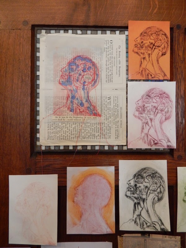
Katie Scott Hamilton also presented a series of portraits which reflected upon the generations who have passed through the church. She quoted a comment left in the visitor’s book: ‘thousands pass by without heeding’. The obverse could also be true; thousands pass by without us heeding them. Most people we pass will forever remain anonymous and unknown to us. Katie arranged a large number of mainly standard-sized pages bearing the same outlined head, gazing upwards as if in veneration. A Vesalius anatomical icon, stripped to vein and muscle. The design was identical. We were seeing beneath the skin to the common corporeal basis of humanity. But this commonality was lent great diversity through the use of different media, different materials and different colours and techniques of reproduction. Some were outlined on tracing paper, giving them an evanescent insubstantiality; some were tapestries; some were stitched in bright threads; some were printed, some drawn. One was overlaid on a section of an Ordnance Survey map, roads forming blood vessels, contours giving dimensionality to the hollow head. Another was placed over a reproduction of part of a 17th century map of Exeter, the eternal spirit of the city. They were all the same, and yet displayed an infinite, endless variety.


Ruth Carpenter fixed further pictures onto the stone columns. Her small scale photographs inserted tiny windows into these solid structures, which bore the load of the roof, and made them seem less substantial. In the heart of the church, they looked inwards, but also out onto the world beyond. In the stained glass which she’d carefully framed in her photos, primary reds were prominent. This gave them a bloodshot look, a dully throbbing morning after haze. In one, a white pane was flushed with swirls of red, blood clouding in a glass of vodka slugged back after a punch up. Another incorporated a passing bus, which provided its own blocks of red livery. Ruth also added another photographic work, a Pieta Mary with sorrowfully downcast eyes. Masking streaks of light made it look as if she were submerged beneath crystalline water.

Clare Heaton drew on fairy tales and The Red Shoes in particular for her work, which bore the collective title ‘Our Moral Fabric’. Filmaking partners Michael Powell and Emeric Pressburger used the story of the red shoes as a parable for the all-consuming nature of art and the sacrifices which it demands. The presiding spirit here seemed rather to be Angela Carter and her collection The Bloody Chamber, however, the stories in which explored the symbolism embedded within fairy tales and folk legends. Clare created a flat representation of a pinafore dress stitched together from pages of the Bible. Its prim collar was made from semi-circles of cu p-cake cases. This appeared to be some kind of communion dress. It was hung up on the wall adjacent to the font. It was a significant placement, the font having associations with motherhood and the expectations and duties which attached to becoming a woman in the traditional communities for which the church stood as moral arbiter and guardian of social propriety. Beneath the dress was a small row of smashed egg shells stuck to a wooden board. There was evidently some level of symbolism at play here, possible operating on many levels at once. They could represent the emergence of the individual self, the transition from childhood, or the desire to resist the pressures of convention and expectation and not have children. Colourful paper butterflies detached themselves from the black and white surface of the text patterned dress and settled on the wall around it. The idea of flight as a symbol of freedom, and of spiritual lightness, takes us back to Judy Harrington’s decaying bird wings. The butterfly is also a creature symbolising transformation and rebirth. Its emergence from the pupa signals a complete metamorphosis, and trace of the caterpillar it once was wholly eradicated. The butterfly is also associated with the soul and with metempsychotis, the transmigration of the soul beyond the mortal plane after death.

Clare’s other work here (the humorous ‘tea with the vicar’ papier-mache cups, saucers and tea pot set aside) represented the transition from childhood to adolescence. A bodice dress replaced the flat pinny, its contours marking the filling out of the body. Fairy wings were attached to the back, a further symbol of transformation, of a soul hovering on the borderlands between states. The body has outgrown these wings, however. They are not large or substantial enough to carry it into the air. A chunky pair of red high-heeled shoes were less the dancing pumps of Hans Christian Andersen or Powell and Pressburger’s tale; more a symbol of a burgeoning awareness of the sensual self, of an awakening sexuality. This, like the other dress, was uninhabited, but both went towards defining a certain transitional stage in a girl’s passage towards womanhood. Again, it is made from biblical pages, sacred scraps, but this time moulded into a papier-mache sculpture. The butterflies have evolved into the more solid forms of winged cloth dollies, which bring a Pagan air into the church. Most churches of a certain vintage have a definite Pagan presence in them somewhere amongst the bosses, corbels and painted panels. There is more continuity between old and new faiths than is generally recognised. The dolls here resemble swaddled, winged babies with pinched adult faces. They are wizened cherubs, fairy folk with a sinister aspect. These are definitely not the anodyne breed from Victorian storybooks, but the older species from the folk tales and legends. The fey but fearful creatures from a timeless otherworld which interconnects with ours in an obscure manner. They are capricious and sometimes vicious in nature, and they can be possessed of sharp teeth. One was placed beneath the plants which lined the stairs at the back of the church, a creature of the green.

This shadowy corner brought the old beliefs back into the light, and combined them harmoniously with the sacred context in which they were placed (they would have looked particularly good at harvest time). This imaginative and carefully thought through use of the space could stand in for the exhibition as a whole. It was a thought provoking exploration of the sacred in our modern, materialist world, and was also an absorbing visual interaction with the church interior and its history. The title, Re-interpretation, was doubly apposite. The artists had re-interpreted St Olave’s architecture, history and place within the culture of the city. But you felt that they had also re-interpreted their own ideas about spirituality, the continuity of place and local character, and the notion of the sacred in the modern world. They had, in short, searched their souls.
1 comment:
Great stuff Jez - It was also good to have a chat with Deb when she came in on Saturday (we mainly speculated on how you manage effortlessly to turn out so many photographs of quality in your facebook output!)
Post a Comment